SwiftUI is a revolutionary way to create user interfaces on iOS and other Apple platforms.
It introduces a new declarative syntax that allows you to build user interfaces packed with features quickly.
In this article, I will show you an overview of the SwiftUI features you will need in every iOS app you will ever build.

FREE GUIDE - SwiftUI App Architecture: Design Patterns and Best Practices
MVC, MVVM, and MV in SwiftUI, plus practical lessons on code encapsulation and data flow.
DOWNLOAD THE FREE GUIDE- SwiftUI’s declarative syntax makes it easy to create user interfaces
- User interfaces in SwiftUI are made of view structures
- The building blocks of user interfaces: text, images and interactive controls
- Composing user interfaces with stacks
- Xcode previews allow you to see the result of your code immediately
- Altering the appearance and layout of views using view modifiers
- Populating SwiftUI views with data
- Creating dynamic tables with reordering and deletion using the List and ForEach views
- Changing the appearance and structure of views with conditional statements
- Updating the data in a single source of truth with bindings
- Adding drill-down navigation and configuring navigation bars
- Adding tabbed navigation and a single source of truth
- Presenting sheets, alerts, and menus through the modal presentation view modifiers
SwiftUI’s declarative syntax makes it easy to create user interfaces
The strong point of SwiftUI is its declarative syntax.
You usually learn the imperative and object-oriented paradigms when you learn to program in Swift or other languages.
In imperative programming, you write a series of statements to describe how your program works.
Object-oriented programming gives more structure to your programs, organizing your code into objects containing data and behavior. But inside objects, you still write code in the imperative paradigm.
You might also be familiar with protocol-oriented programming in Swift, although that’s a more advanced concept usually not taught to beginners. In any case, protocol-oriented programming is very similar to object-oriented programming.
SwiftUI, instead, follows a declarative paradigm, where you state what your program does instead of how it works. This works exceptionally well for building user interfaces, where an imperative/object-oriented approach creates a ton of boilerplate code.
SwiftUI’s syntax might be a bit off-putting, at first, for someone used to write imperative code. But you can adapt to it quickly, as testified by many iOS developers that now prefer to use SwiftUI over UIKit.
User interfaces in SwiftUI are made of view structures
SwiftUI interfaces are made of views. This idea is not new and comes from the MVC pattern. In short, the role of a view is to show information to the user and enable interaction.
In SwiftUI, views are simple Swift structures conforming to the View protocol. Whenever you create a new Xcode project, you get a first view where you can start building your interface.
struct ContentView: View {
    var body: some View {
        Text("Hello, World!")
    }
}
The View protocol has only one requirement: a body computed property where you declare the view’s content, for example, a Text view containing the classic "Hello, World!" message.
Here, you might find the first two confusing parts of SwiftUI’s syntax that you probably did not learn in your programming course.
The first is the some keyword in the return type of the body property. That’s an opaque result type, a feature introduced in Swift 5.1. It allows you to hide the returned value behind the View protocol. All you need to know about opaque types, for now, is that they make it easier to write and change SwiftUI code.
The other bit of puzzling SwiftUI syntax is that the body property returns a value like any other computed property, even if it has no return keyword. This is thanks to another feature of Swift called implicit returns, which allows you to omit the return keyword in functions with only one expression.
In reality, the code above still has a return statement, even if it’s not explicit. It might not seem a big deal, but this is one of the bits that makes SwiftUI’s syntax declarative.
The building blocks of user interfaces: text, images and interactive controls
In this article, we will create a simple app to show a list of movies.
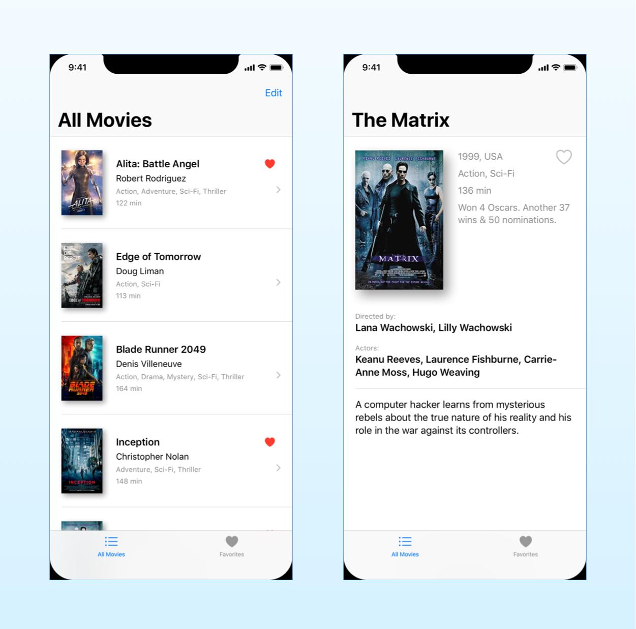
The interface of our app will contain many aspects common to most iOS apps. The user can select a movie from a list and navigate to a screen showing its details. The app also features a tab bar with a Favorites section, and the user can reorder and delete the rows in the list.
In UIKit, you would need to know many concepts to build such an interface: view controllers and containers, table views with data sources and delegates, Auto Layout, and storyboards and segues.
In SwiftUI, it is much simpler to get the same result. You can find the complete Xcode project here to follow along.
Let’s start with the rows in our movie list. Like most parts of an app’s UI, these are composed of essential elements like text and images.
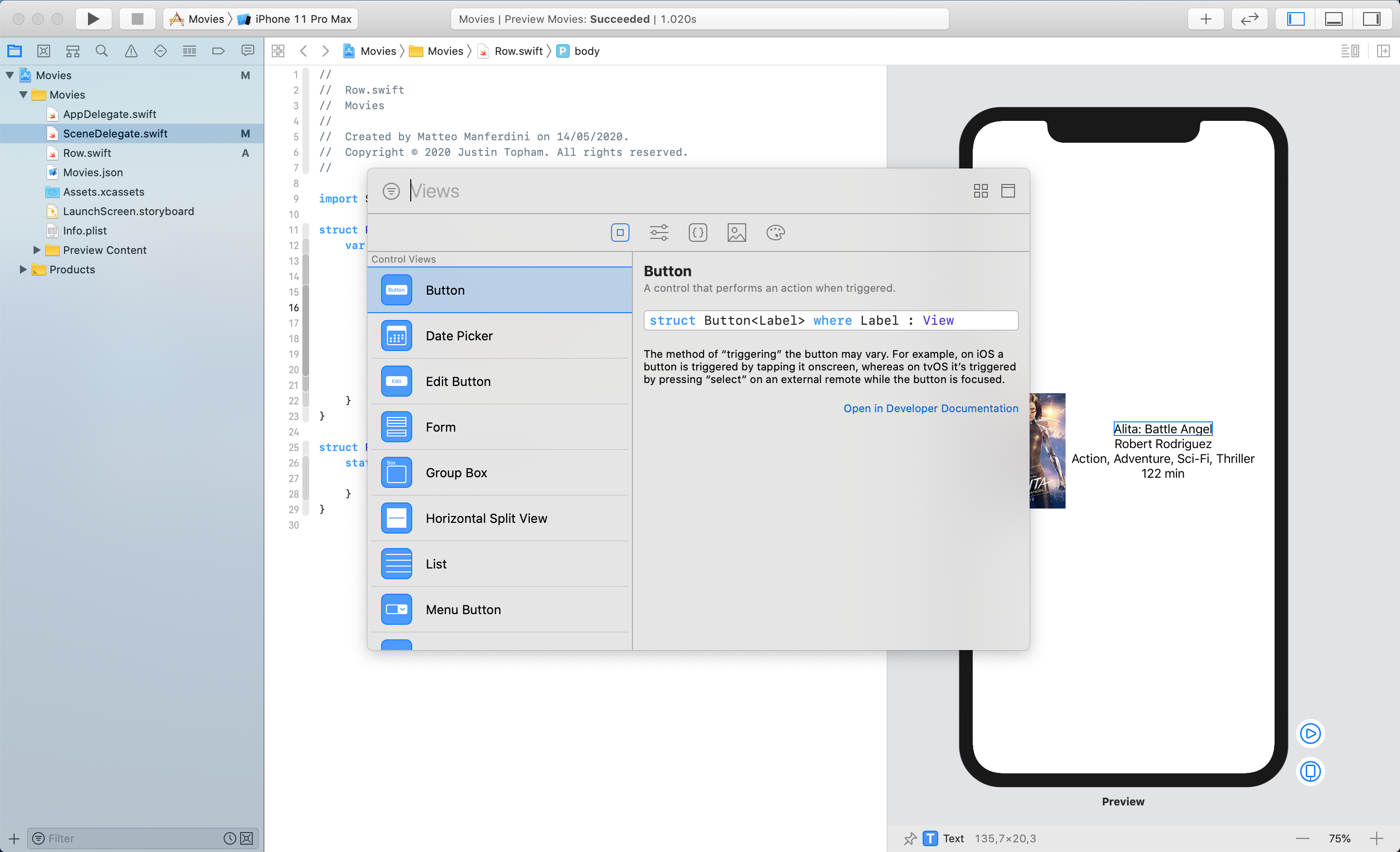
SwiftUI offers views for all the necessary interface pieces of iOS. These go from simple types like Text and Image to interactive controls like Button, Toggle, Picker, and so on. If you are not familiar with these, you can learn what they are in Apple’s Human Interface Guidelines for iOS.
Composing user interfaces with stacks
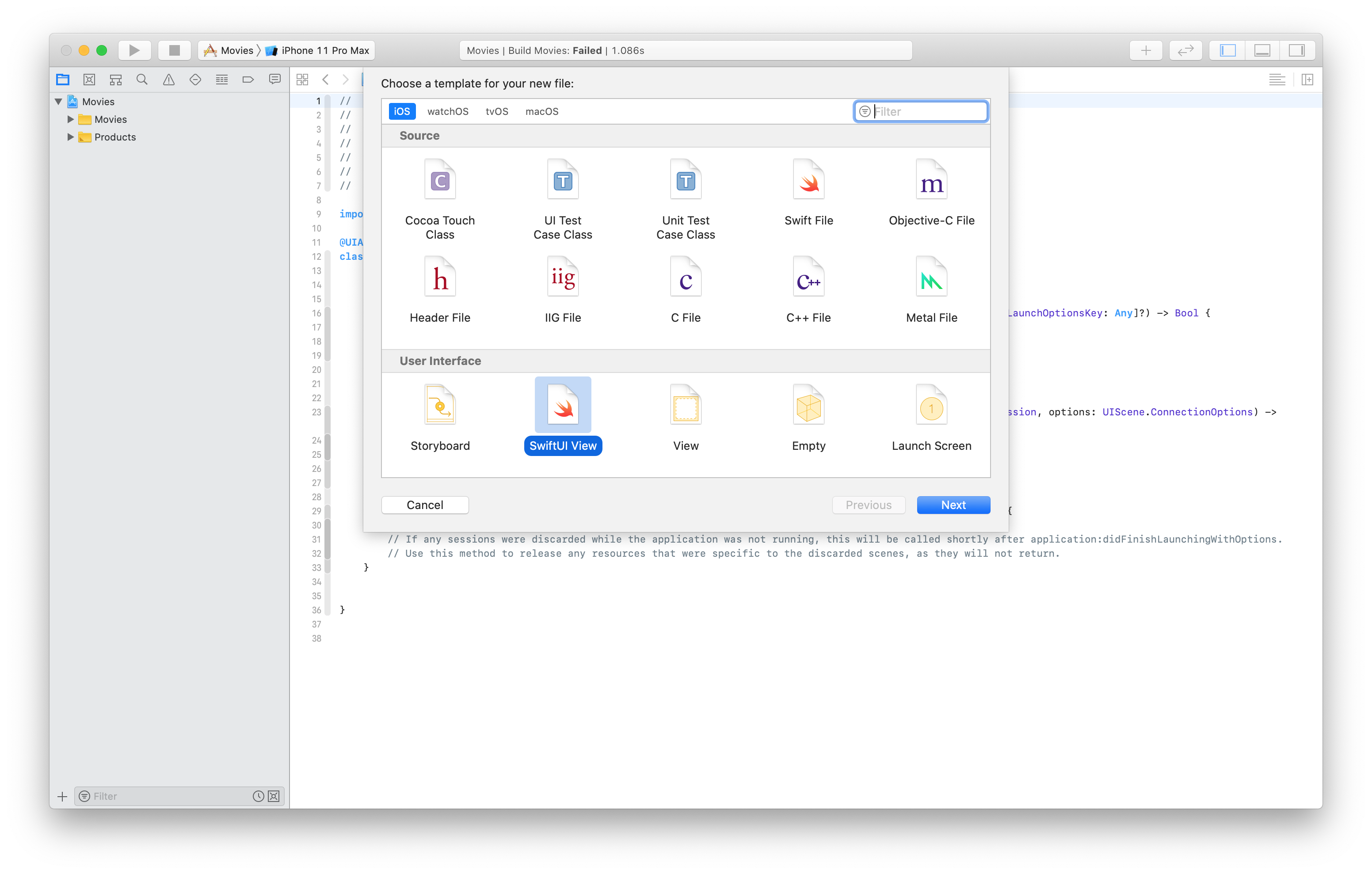
In Xcode, you can create new files for SwiftUI views, which will contain some basic template code.
We can’t merely put views together in the body property. If you try to list views one after another, the compiler will complain.
struct Row: View {
	var body: some View {
		Image("Alita")
		Text("Alita: Battle Angel")
	}
}
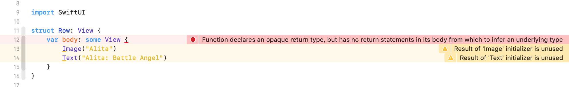
Recall that, implicit returns in Swift work only with a single expression. Here, we have two.
To layout views and compose structured interfaces, you have to use stacks. SwiftUI offers three:
HStackfor horizontal arrangements,VStackto arrange views vertically, andZStack, to overlay views in front of each other.
struct Row: View {
	var body: some View {
		HStack() {
			Image("Alita")
			VStack {
				Text("Alita: Battle Angel")
				Text("Robert Rodriguez")
				Text("Action, Adventure, Sci-Fi, Thriller")
				Text("122 min")
			}
		}
	}
}
Notice that, while the body property of a view accepts only a single expression, stacks are fine with more than one. If you are curious why that’s possible, it’s thanks to another feature of Swift called function builders.
You find stacks and all the other layout views of SwiftUI here, including other ones I will cover later in this article.
Xcode previews allow you to see the result of your code immediately
SwiftUI’s declarative syntax is excellent to put together user interfaces, but in code, we can’t see the result visually ad we could in UIKit’s interface files.
Obviously, you can run your app in the simulator, but that becomes tedious as your app grows.
Luckily, Xcode allows us to preview our SwiftUI code.
You create previews in code as you do for SwiftUI views. Any time you create a new SwiftUI view file in Xcode, you get the preview code for free in the template.
struct Row_Previews: PreviewProvider {
static var previews: some View {
Row()
}
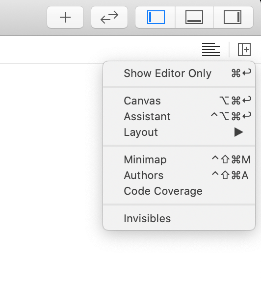
}You can then see the result in the Xcode canvas, which you can bring out using the Adjust Editor Options menu.

Xcode previews are interactive. Clicking on any view highlights the corresponding code in the editor.
You can also add new views directly to a preview by dragging them from the Library, which you bring up by clicking on the plus button in the Xcode toolbar.
And finally, you can change the attributes of each view using the Attributes inspector of Xcode, in the right sidebar, or by cmd-clicking on the desired view and selecting Show SwiftUI Inspector from the contextual menu.
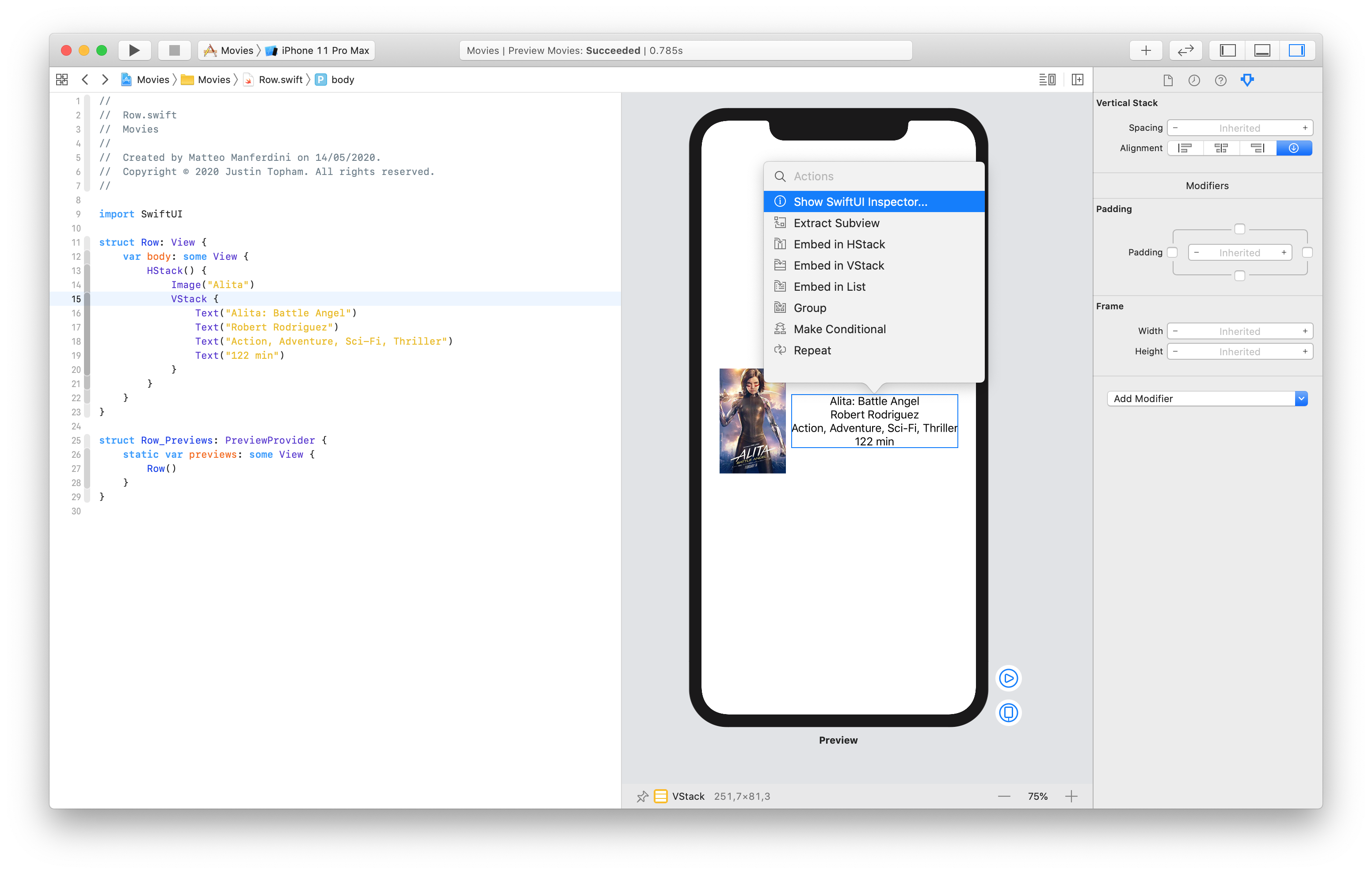
For example, in these panels, we can change the alignment and spacing of our stacks and match the ones in the mockup. Any change is immediately reflected in our code.
struct Row: View {
	var body: some View {
		HStack(spacing: 24.0) {
			Image("Alita")
			VStack(alignment: .leading, spacing: 4.0) {
				Text("Alita: Battle Angel")
				Text("Robert Rodriguez")
				Text("Action, Adventure, Sci-Fi, Thriller")
				Text("122 min")
			}
		}
	}
}
I was a fan of storyboards in UIKit because they eliminated code, which was often tedious and full of boilerplate. In SwiftUI, though, I usually find it faster to type all my SwiftUI code than working with the interactive previews.
Altering the appearance and layout of views using view modifiers
We have made some progress, but our movie entry still does not look like the one we have in our mockup.
First of all, we need to change the size and weight of the text views. In SwiftUI, you can control some view properties through initializers’ parameters, e.g., the alignment in our VStack above.
But we can’t put every single property in an initializer, or our code would be unreadable. The SwiftUI solution is to rely on view modifiers, which are methods you append to your views.
struct Row: View {
	var body: some View {
		HStack() {
			Image("Alita")
			VStack(alignment: .leading, spacing: 4.0) {
				Text("Alita: Battle Angel")
					.font(.headline)
				Text("Robert Rodriguez")
					.font(.subheadline)
				Text("Action, Adventure, Sci-Fi, Thriller")
				Text("122 min")
			}
		}
	}
}
Modifiers are another part of the declarative syntax of SwiftUI that might seem puzzling at first. In imperative Swift code, we cannot append methods one after the other. SwiftUI makes it possible by using an advanced technique called method chaining.
Again, you don’t need to know how that works. But if you are curious, each modifier returns a new view to which the next modifier is applied.
All you need to know is that you can use modifiers one after another and that sometimes their order matters. If the result is not what you expect, try reordering them.
View modifiers have a considerable role in SwiftUI. In our example, we can also use them to resize the image and to add a shadow to it. SwiftUI also has a series of modifiers to control Xcode previews.
struct Row: View {
	var body: some View {
		HStack(spacing: 24.0) {
			Image("Alita")
				.resizable()
				.frame(width: 70.0, height: 110.0)
				.shadow(color: .gray, radius: 10.0, x: 4.0, y: 4.0)
			VStack(alignment: .leading, spacing: 4.0) {
				Text("Alita: Battle Angel")
					.font(.headline)
				Text("Robert Rodriguez")
					.font(.subheadline)
				Group {
					Text("Action, Adventure, Sci-Fi, Thriller")
					Text("122 min")
				}
				.font(.caption)
				.foregroundColor(.secondary)
			}
			Spacer()
		}
	}
}

struct Row_Previews: PreviewProvider {
	static var previews: some View {
		Row()
			.padding()
			.previewLayout(.sizeThatFits)
	}
}
When you want to apply the same modifiers to more than one view, you can use a Group. The modifiers will be applied to all the contained views.
And finally, the Spacer view pushed all the content to the left.
In SwiftUI, layouts are centered by default. We can control the layout of stacks, but only perpendicularly to their axis. If instead, you want to move elements along the axis of a stack, you need to use one or more Spacer views.
Populating SwiftUI views with data
Until now, we hardcoded movie information in our Row type. To display a list of movies, we now need some data.
The most common way to embed static data in an app is to put it in a .json file in the Xcode project.
[
	{
		"Title":"Alita: Battle Angel",
		"Year":"2019",
		"Runtime":"122 min",
		"Genre":"Action, Adventure, Sci-Fi, Thriller",
		"Director":"Robert Rodriguez",
		"Actors":"Rosa Salazar, Christoph Waltz, Jennifer Connelly, Mahershala Ali",
		"Plot":"A deactivated cyborg is revived, but cannot remember anything of her past life and goes on a quest to find out who she is.",
		"Country":"USA",
		"Awards":"8 wins & 25 nominations.",
		"Poster":"Alita"
	}
]
For conciseness, above, you see the data for a single movie. You find the full data in the Xcode project. I took it from the Open Movie Database API, together with the movie posters.
Now we need a model type conforming to the Decodable protocol into which we can read our JSON data.
struct Movie: Decodable {
    let title: String
    let year: String
    let runtime: String
    let genre: String
    let director: String
    let actors: String
    let plot: String
    let country: String
    let awards: String
    let poster: String
}
Then, we can read our .json file using a JSONDecoder.
struct TestData {
	static var movies: [Movie] = {
		let url = Bundle.main.url(forResource: "Movies", withExtension: "json")!
		let data = try! Data(contentsOf: url)
		let decoder = JSONDecoder()
		return try! decoder.decode([Movie].self, from: data)
	}()
}
You can find more about JSON decoding in my Codable article.
And finally, we need to remove the hardcoded values from our Row structure, replacing it with a property with type Movie.
struct Row: View {
	let movie: Movie

	var body: some View {
		HStack(spacing: 24.0) {
			Image(movie.poster)
				.resizable()
				.frame(width: 70.0, height: 110.0)
				.shadow(color: .gray, radius: 10.0, x: 4.0, y: 4.0)
			VStack(alignment: .leading, spacing: 4.0) {
				Text(movie.title)
					.font(.headline)
				Text(movie.director)
					.font(.subheadline)
				Group {
					Text(movie.genre)
					Text(movie.runtime)
				}
				.font(.caption)
				.foregroundColor(.secondary)
			}
			Spacer()
		}
	}
}

struct Row_Previews: PreviewProvider {
	static var previews: some View {
		Row(movie: TestData.movies[0])
			.padding()
			.previewLayout(.sizeThatFits)
	}
}
Creating dynamic tables with reordering and deletion using the List and ForEach views
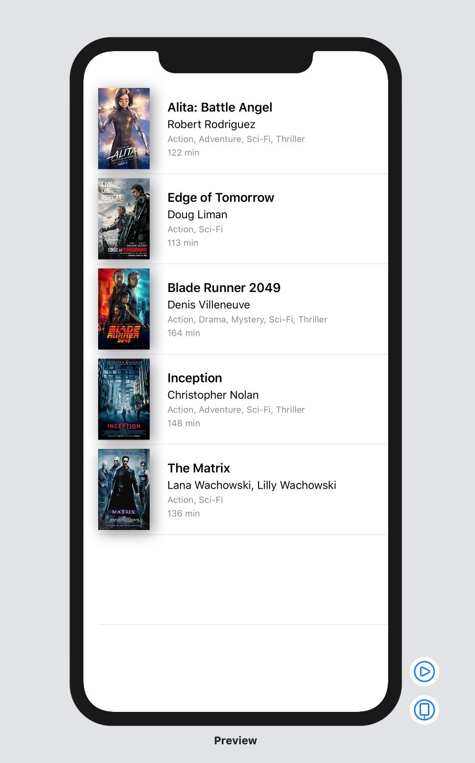
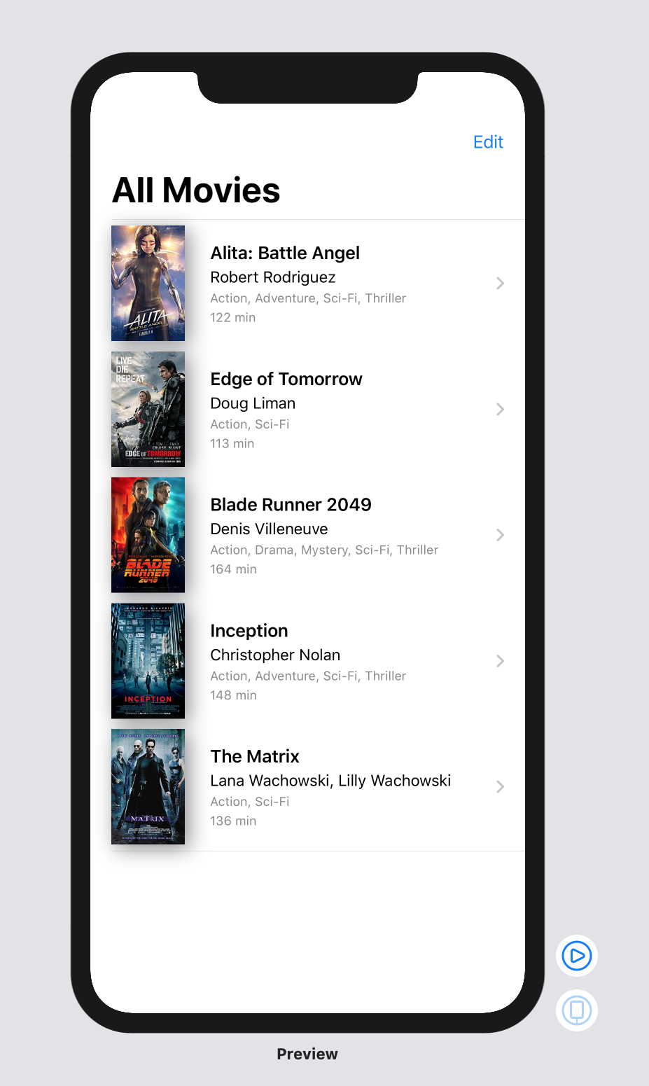
If you come from UIKit, you will appreciate how easy it is to create tables in SwiftUI. Gone are the days of cell prototypes, data sources, and delegates.
Now, all you need to do is create a List view, pass it an array with your data and declare which views to use as rows.
struct MoviesView: View {
	var body: some View {
		List(TestData.movies, id: \.title) { movie in
			Row(movie: movie)
		}
	}
}

struct MoviesView_Previews: PreviewProvider {
    static var previews: some View {
        MoviesView()
    }
}
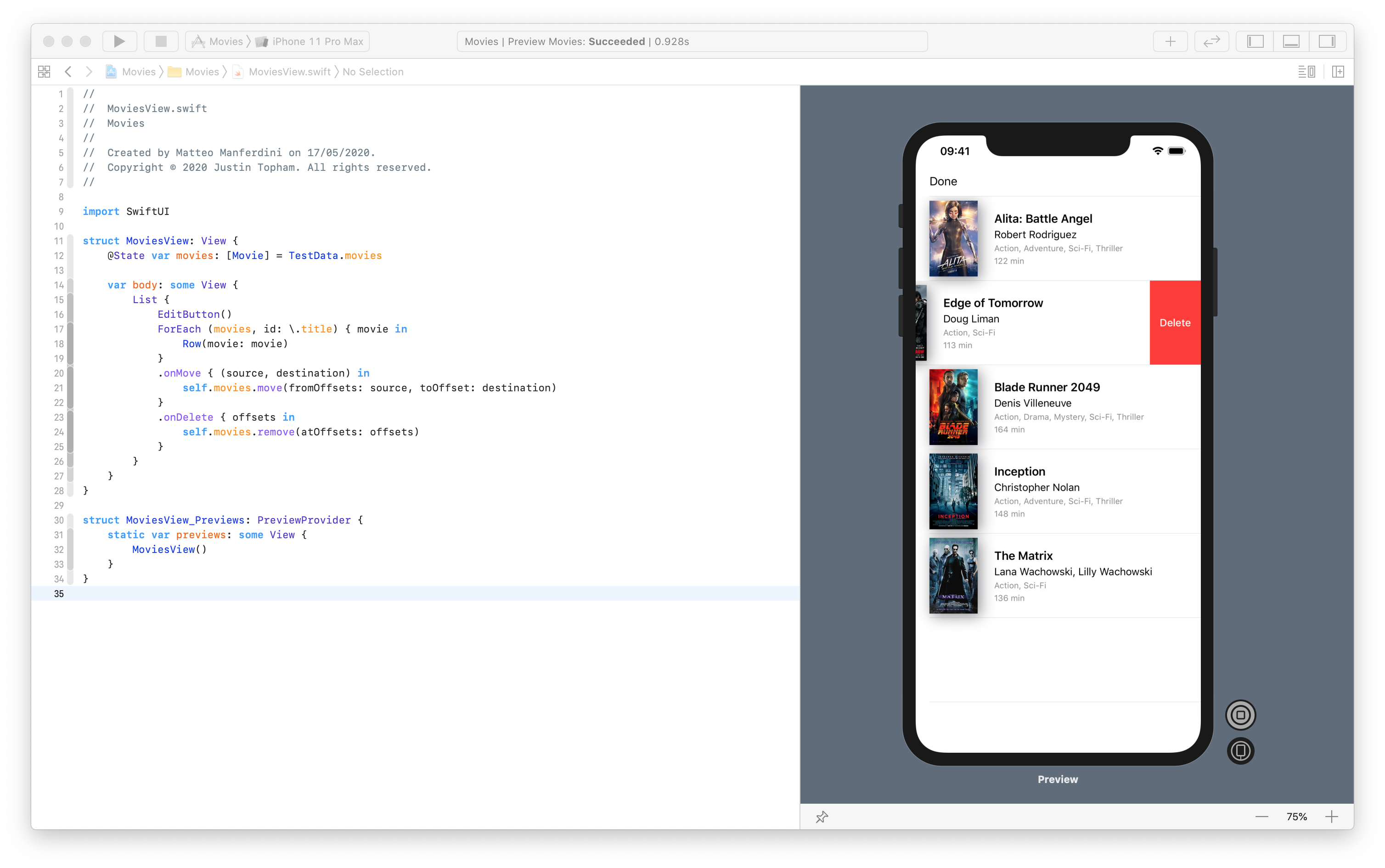
And it does not stop there. Adding row reordering and deletion to a table is also straightforward.
struct MoviesView: View {
	@State var movies: [Movie] = TestData.movies

	var body: some View {
		List {
			EditButton()
			ForEach (movies, id: \.title) { movie in
				Row(movie: movie)
			}
			.onMove { (source, destination) in
				self.movies.move(fromOffsets: source, toOffset: destination)
			}
			.onDelete { offsets in
				self.movies.remove(atOffsets: offsets)
			}
		}
	}
}
Here some more explanation is in order.
First of all, any mutable data in a SwiftUI app needs to be stored in @State and @ObservedObject properties. You can get my free guide on SwiftUI App Architecture to know when to use each.
The List view cannot move or delete rows. For that, we need to use a ForEach view inside of it, which provides the .onMove and .onDelete modifiers.
The .onDelete modifier enables the swipe-to-delete feature of iOS tables straight away. But, to move rows, the table needs to be in edit mode. That’s that the EditButton at the top is for (we will place it in a better location later).
Again, you don’t need to run the whole app to test these new features. You can run a view directly inside the preview canvas by clicking on the play button next to it.
Changing the appearance and structure of views with conditional statements
Often, our user interfaces have elements that change appearance based on some condition.
SwiftUI does not allow the full range of conditional expressions of Swift, but you can use if-else statements and the ternary operator.
The former is useful to change the structure of the view hierarchy, while the latter is useful to change the visual appearance of a view in initializers and view modifiers.
First of all, let’s see how to change a view’s appearance. In our mockup, we have a heart-shaped button that allows the user to set a movie as a favorite. The button changed both its shape (empty vs. filled) and color (grey vs. red).
Since we will need the heart shape both in the movies list and the movie details screens, let’s create a separate view which we can reuse.
struct Heart: View {
	let isFilled: Bool;

	var body: some View {
		Image(systemName: isFilled ? "heart.fill" : "heart")
			.foregroundColor(isFilled ? .red : .secondary)
	}
}

struct HeartSymbol_Previews: PreviewProvider {
	static var previews: some View {
		Group {
			Heart(isFilled: true)
			Heart(isFilled: false)
		}
		.padding()
		.previewLayout(.sizeThatFits)
	}
}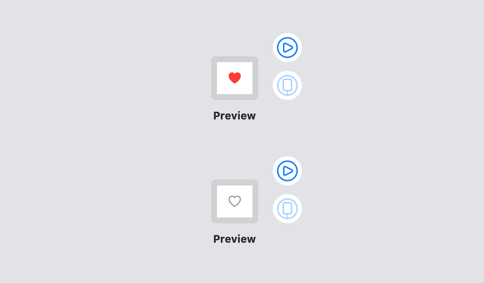
In SwiftUI, we affect the appearance of views by changing the parameters of initializers and view modifiers. In such cases, using an if-else statement would work, but produce some code repetition. When possible, it’s better to use the ternary operator.
The heart icon comes from SF Symbols, a new collection of symbols available to apps running in iOS 13 and later. To browse the entire collection, download the SF Symbols app on your Mac.
If-else statements are, instead, useful to change the structure of the view hierarchy by adding, removing, and replacing views. We can use it to add a heart symbol to the rows of favorite movies.
struct Row: View {
	let movie: Movie

	var body: some View {
		HStack(spacing: 24.0) {
			Image(movie.poster)
				.resizable()
				.frame(width: 70.0, height: 110.0)
				.shadow(color: .gray, radius: 10.0, x: 4.0, y: 4.0)
			VStack(alignment: .leading, spacing: 4.0) {
				HStack {
					Text(movie.title)
						.font(.headline)
					Spacer()
					if movie.isFavorite {
						Heart(isFilled: true)
					}
				}
				Text(movie.director)
					.font(.subheadline)
				Group {
					Text(movie.genre)
					Text(movie.runtime)
				}
				.font(.caption)
				.foregroundColor(.secondary)
			}
		}
	}
}
Updating the data in a single source of truth with bindings
Our app has one more screen where the user can see the details of a movie and favorite it. It’s usually a good practice to break down the user interface of complex screens into modular views.
Let’s start with the info at the bottom of the screen.
struct BottomInfo: View {
	let movie: Movie

	var body: some View {
		VStack (alignment: .leading, spacing: 16.0) {
			VStack(alignment: .leading) {
				Text("Directed by:")
					.font(.caption)
					.foregroundColor(.secondary)
				Text(movie.director)
					.font(.headline)
			}
			VStack(alignment: .leading) {
				Text("Actors:")
					.font(.caption)
					.foregroundColor(.secondary)
				Text(movie.actors)
					.font(.headline)
			}
			Divider()
			Text(movie.plot)
				.font(.body)
		}
	}
}

struct DetailsView_Previews: PreviewProvider {
	static let movie = TestData.movies[0]

	static var previews: some View {
		BottomInfo(movie: movie)
			.padding()
			.previewLayout(.sizeThatFits)
		}
	}
}
There is nothing new here. I just used a combination of stacks, basic views, and modifiers to match the app’s mockup.
The info at the side of a photo follows the same ideas, with a crucial difference.
struct SideInfo: View {
	@Binding var movie: Movie

	var body: some View {
		VStack (alignment: .leading, spacing: 8.0) {
			HStack (alignment: .top) {
				VStack (alignment: .leading, spacing: 8.0) {
					Text(movie.year + " , " + movie.country)
					Text(movie.genre)
					Text(movie.runtime)
				}
				.font(.callout)
				.foregroundColor(.secondary)
				.padding(.top, 6)
				Spacer()
				Button(action: { self.movie.isFavorite.toggle() }) {
					Heart(isFilled: movie.isFavorite)
						.font(.title)
				}
			}
			Text(movie.awards)
				.font(.callout)
				.foregroundColor(.secondary)
		}
	}
}

struct DetailsView_Previews: PreviewProvider {
	static let movie = TestData.movies[0]

	static var previews: some View {
		Group {
			SideInfo(movie: .constant(movie))
			BottomInfo(movie: movie)
		}
		.padding()
		.previewLayout(.sizeThatFits)
	}
}
Notice that the movie property of this view has the @Binding property wrapper.
This view contains a button that allows the user to favorite a movie. Its action toggles the isFavorite property of the Movie structure.
The data containing all movies belong to the global state of our app. In the SideInfo view, we don’t know where that data resides, nor do we care. All we need to know is that the action of the button needs to change it.
Whenever a view in SwiftUI needs to update data that resides somewhere else, we use a binding. A binding is a reference that reaches data stored elsewhere, which, in SwiftUI, is called the single source of truth.
Bindings are used extensively by interactive views that allow the user to enter data, e.g., the TextField and Toggle types.
The view for the entire screen does not contain the global data for our app either, so it also needs a binding.
struct DetailsView: View {
	@Binding var movie: Movie

	var body: some View {
		VStack(alignment: .leading, spacing: 36.0) {
			HStack (alignment: .top, spacing: 24.0) {
				Image(movie.poster)
					.resizable()
					.frame(width: 150.0, height: 237.0)
					.shadow(color: .gray, radius: 10.0, x: 5.0, y: 5.0)
				SideInfo(movie: $movie)
			}
			BottomInfo(movie: movie)
			Spacer()
		}
		.padding(.top, 18)
		.padding(.horizontal, 20)
		.navigationBarTitle(movie.title)
	}
}

struct DetailsView_Previews: PreviewProvider {
	static let movie = TestData.movies[0]

	static var previews: some View {
		Group {
			DetailsView(movie: .constant(movie))
			Group {
				SideInfo(movie: .constant(movie))
				BottomInfo(movie: movie)
			}
			.padding()
			.previewLayout(.sizeThatFits)
		}
	}
}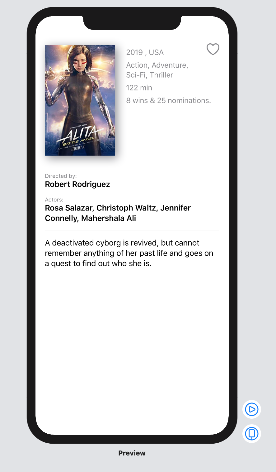
Notice that a $ sign precedes the movie parameter for the SideInfo view. This is a SwiftUI operator you use to connect bindings to data.
You can connect bindings to @State and @ObservedObject properties, or other bindings, like in this case. These chains of bindings allow us to pass changes up the view hierarchy until we reach the single source of truth. To know more, refer to my free guide.
Adding drill-down navigation and configuring navigation bars
Now that we have a list of movies and a screen for details let’s connect them through the typical drill-down navigation of iOS apps.
In SwiftUI, the two main navigation flows of iOS apps are achieved through architectural views, namely NavigationView and TabView.
We could place a NavigationView in our MoviesView, and it would work in our little example, but that would not be the right place. It’s better to have a central view that coordinates the navigation flow of an app.
struct MainView: View {
	var body: some View {
		NavigationView {
			MoviesView()
		}
	}
}
Once a view is embedded in a NavigationView, we can set its navigation bar title and items using view modifiers.
struct MoviesView: View {
	@State var movies: [Movie] = TestData.movies

	var body: some View {
		List {
			ForEach (movies, id: \.title) { movie in
				Row(movie: movie)
			}
			.onMove { (source, destination) in
				self.movies.move(fromOffsets: source, toOffset: destination)
			}
			.onDelete { offsets in
				self.movies.remove(atOffsets: offsets)
			}
		}
		.navigationBarTitle("All Movies")
		.navigationBarItems(trailing: EditButton())
	}
}
We finally have a better place for that rogue EditButton.
These view modifiers can set the navigation bar of the navigation view in which the MoviesView is contained thanks to a sophisticated SwiftUI mechanism called preferences. This allows views at any depth in a hierarchy to communicate with an ancestor.
And finally, we use a NavigationLink to connect our MoviesView to the DetailsView, triggering navigation when the user taps on a movie in the table.
struct MoviesView: View {
	@State var movies: [Movie] = TestData.movies

	var body: some View {
		List {
			ForEach (movies, id: \.title) { movie in
				NavigationLink(destination: DetailsView(movie: self.$movies[self.index(for: movie)])) {
					Row(movie: movie)
				}
			}
			.onMove { (source, destination) in
				self.movies.move(fromOffsets: source, toOffset: destination)
			}
			.onDelete { offsets in
				self.movies.remove(atOffsets: offsets)
			}
		}
		.navigationBarTitle("All Movies")
		.navigationBarItems(trailing: EditButton())
	}
}

private extension MoviesView {
	func index(for movie: Movie) -> Int {
		movies.firstIndex(where: { $0.title == movie.title }) ?? 0
	}
}

struct MoviesView_Previews: PreviewProvider {
	static var previews: some View {
		NavigationView {
			MoviesView()
		}
	}
}
A NavigationLink creates navigation from the view it contains to a destination view. In our case, each Row gets a navigation link pointing to the DetailsView.
If the destination view took a plain value as a parameter, we could simply pass to it the movie parameter of the closure.
But since the DetailsView view wants a binding, we need to connect it to the movie in the movies state variable, which, at the moment, is our single source of truth. That is why I added the extra index(for:) method to MovieView.
The appearance of a NavigationLink depends on the view hierarchy that contains is. Typically, navigation links look like buttons, but inside tables, they add a disclosure indicator to rows instead.
Adding tabbed navigation and a single source of truth
To complete our app, we will add tabbed navigation.
In our example, the second tab contains a simple list of favorite movies. We can adapt our MoviesView for the purpose.
struct MoviesView: View {
	@Binding var movies: [Movie]
	let showOnlyFavorites: Bool

	var body: some View {
		List {
			ForEach (displayedMovies, id: \.title) { movie in
				NavigationLink(destination: DetailsView(movie: self.$movies[self.index(for: movie)])) {
					Row(movie: movie)
				}
			}
			.onMove { (source, destination) in
				self.movies.move(fromOffsets: source, toOffset: destination)
			}
			.onDelete { offsets in
				self.movies.remove(atOffsets: offsets)
			}
		}
		.navigationBarTitle("All Movies")
		.navigationBarItems(trailing: showOnlyFavorites ? nil : EditButton())
	}
}

private extension MoviesView {
	var displayedMovies: [Movie] {
		showOnlyFavorites
			? movies.filter { $0.isFavorite }
			: movies
	}

	func index(for movie: Movie) -> Int {
		movies.firstIndex(where: { $0.title == movie.title })!
	}
}
The MovieView type now has an extra showOnlyFavorites property, which we use to filter movies in the displayedMovies. That’s what we then use to populate the table.
Also, notice that the movies property is now a binding and not a @State property anymore. Since both tabs need to share the same data, the single source of truth needs to live higher in the view hierarchy, where both tabs can reach it.
In a real app, the single source of truth would be located in a state controller. For simplicity’s sake, we can put it in the MainView, which is the starting point of our user interface.
struct MainView: View {
	@State var movies: [Movie] = TestData.movies

	var body: some View {
		TabView {
			NavigationView {
				MoviesView(movies: $movies, showOnlyFavorites: false)
			}
			.tabItem {
				Image(systemName: "list.bullet")
					.font(.system(size: 26))
				Text("All movies")
			}
			NavigationView {
				MoviesView(movies: $movies, showOnlyFavorites: true)
			}
			.tabItem {
				Image(systemName: "heart")
					.font(.system(size: 26))
				Text("Favorites")
			}
		}
	}
}
Like the NavigationView, a TabView is also an architectural view. You get a tab for every view you list in its trailing closure.
To configure the icon and the title of each tab, you use the .tabItem view modifier, which only accepts Image and Text views.
Presenting sheets, alerts, and menus through the modal presentation view modifiers
We have one last piece of primary navigation for iOS apps to explore: modal presentation.
While the main navigation of an iOS app is managed by architectural views like NavigationView and TabView, modal presentation happens through three view modifiers:
- the
.alertmodifier shows a small alert panel in the middle of the screen, with one or two buttons; - the
.actionSheetmodifier presents a menu with several options; - the
.sheetmodifier presents a full-screen view.
These view modifiers all work in the same way. They get, as a parameter, a binding connected to a boolean state property that controls presentation and dismissal.
As an example, we can present an action sheet to ask for confirmation to the user before deleting a movie in the table.
struct MoviesView: View {
	@Binding var movies: [Movie]
	let showOnlyFavorites: Bool

	@State private var deletionOffsets: IndexSet = []
	@State private var isShowingDeleteConfirmation: Bool = false

	var body: some View {
		List {
			ForEach (displayedMovies, id: \.title) { movie in
				NavigationLink(destination: DetailsView(movie: self.$movies[self.index(for: movie)])) {
					Row(movie: movie)
				}
			}
			.onMove { (source, destination) in
				self.movies.move(fromOffsets: source, toOffset: destination)
			}
			.onDelete { offsets in
				self.deletionOffsets = offsets
				self.isShowingDeleteConfirmation = true
			}
		}
		.navigationBarTitle("All Movies")
		.navigationBarItems(trailing: showOnlyFavorites ? nil : EditButton())
		.actionSheet(isPresented: $isShowingDeleteConfirmation) {
			ActionSheet(title: Text("Are you sure?"), message: Text("The action is not reversible"), buttons: [
				.destructive(Text("Delete movie"), action: { self.movies.remove(atOffsets: self.deletionOffsets) }),
				.cancel()
			])
		}
	}
}
The presentation of the action sheet is connected to the isShowingDeleteConfirmation state property.
When the user tries to delete a movie, we store its offset in the table and set the state property to true in the .onDelete modifier. This causes the action sheet to appear.
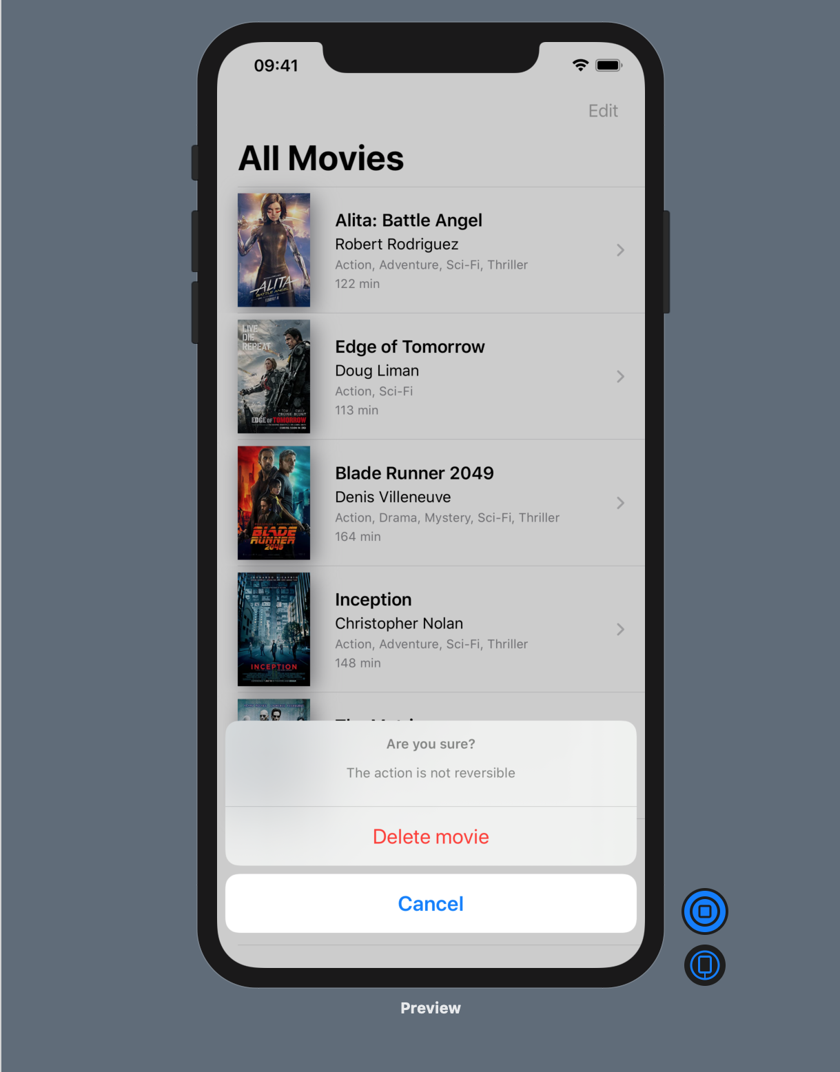
Then, when the user confirms by tapping on the Delete movie button, we call remove(atOffsets:) on the movies array.
Conclusions
SwiftUI is a vast departure from the old way of building iOS user interfaces in UIKit with Xcode storyboards.
The declarative syntax of SwiftUI brings consistency to UI development and speeds up many of the tasks that required several moving in the past.
There is, of course, more to building SwiftUI apps than I could cover in this article.
A fundamental aspect of any iOS app is its architecture, which is more accurate than ever in SwiftUI. Its simple mechanisms and declarative syntax make it easier than ever to misplace code and create massive, unmanageable views.
You can find more about architecting SwiftUI apps in my free guide below.
SwiftUI App Architecture: Design Patterns and Best Practices
It's easy to make an app by throwing some code together. But without best practices and robust architecture, you soon end up with unmanageable spaghetti code. In this guide I'll show you how to properly structure SwiftUI apps.
Matteo has been developing apps for iOS since 2008. He has been teaching iOS development best practices to hundreds of students since 2015 and he is the developer of Vulcan, a macOS app to generate SwiftUI code. Before that he was a freelance iOS developer for small and big clients, including TomTom, Squla, Siilo, and Layar. Matteo got a master’s degree in computer science and computational logic at the University of Turin. In his spare time he dances and teaches tango.
Thanks as always for the fantastic content, Matteo.
Your suggestion to use
self.$movies[self.index(for: movie)]has definitely helped me: I was struggling with the fact that ForEach views with numeric ranges only work for static data.That said, I’ve attempted a similar implementation in my app, but keep getting an index out of range error (see below) immediately after deleting an element from the main array. The deletion works, because that element’s gone next time I start up, but the app still crashes. It seems to be something to do with the views still trying to reload that same data, even after it’s gone.
Is this something you’ve faced at all? The only real differences I can see from what you have here is that:
(A) My array’s kept as a @Published var in an @EnvironmentObject state manager class, rather than a local @State in the parent view.
(B) My list view doesn’t use a SwiftUI List (just a VStack + ForEach), and therefore uses a button to trigger the delete action instead of .onDelete.
Not sure if either of these differences should cause an issue?
One of my collaborators found that problem as well. It looks like a SwiftUI bug with state/bindings and arrays.
This article just explores the basics of SwiftUI. A fix that should work (but I haven’t verified) is to move the array to an environment object. Check my article on MVC or my guide to MVC/MVVM to see how to do that.