Auto Layout is a complex beast to tame.
Creating adaptive apps that fit the sizes and proportions of all iOS devices is a complex problem. We can only solve it with a complex solution.
But you don’t need the full power of Auto Layout all the time.
Most apps have fairly straightforward interfaces. Most of the time, you can go a long way by only using Auto Layout’s basic features in an app’s storyboard.
That’s the Pareto Principle at play: learn the 20% of Auto Layout’s functionality that covers 80% of the cases.
From there, you can expand and include the what you miss to solve the problems you have at hand.
Architecting SwiftUI apps with MVC and MVVM
GET THE FREE BOOK NOWContents
Section 1
The iOS View Hierarchy and Auto Layout
Section 2
Building and Previewing UIs in Interface Builder

Section 3
How layout constraints transform your User Interface

Section 4
Keeping Views Well-Positioned on the screen of any iOS Device

Section 5
Adapting your Layouts to Dynamic Content

Section 6
Creating Auto Layout constraints programmatically in Swift

Bonus Section
Going past simple constraints for highly-adaptive, universal user interfaces
Section 1:
The iOS View Hierarchy and Auto Layout
Auto Layout does not change how iOS renders content on the screen. So you cannot ignore the fundamentals of the iOS view hierarchy and how Auto Layout interacts with them.
Missing these fundamentals is what often leads to confusion and to interfaces that do not behave as expected.
Why you need to use Auto Layout in any modern iOS app
Today’s App Store is highly competitive.
With more than two million apps, which were downloaded more than 130 billion times, any modern app needs a slick user interface to give a great experience to its users.
As the saying goes, you only have one chance to make a first impression. Data shows that 60% of users don’t go past the first two screenshots of your app.
So, a UI like this one is almost a must:
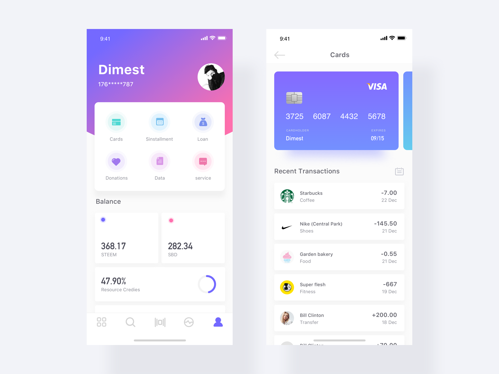
Credits: Dimest, via Dribbble
In the old days, there were only a handful of iPhone models, and all had the same screen size.
Building UIs was easier. You could place elements in their final position and call it a day. If you wanted to use some special effect, you could achieve it with some Photoshop tricks (and the help of a good designer).
That’s not the case anymore.
Today, your app needs to adapt to iPhones with different screen sizes and resolution.
And that’s just the beginning.
Modern universal apps work on both iPhones and iPads. If different screen sizes did not complicate things enough, your app also has to work on different screen orientations.
And it does not even stop there.
On the iPad, you can run apps side by side. That brings a lot more combinations to the table, forcing your app to adapt not only to different sizes but also to various form factors.
As Apple states in this presentation, there are now 300+ combinations to which your interface has to adapt.

It’s clear that making all the calculations necessary to adapt your app to all these use cases can be very complicated. And if you add animation to the mix, it gets even harder.
That’s why, in iOS 7, Apple introduced Auto Layout.
Under this new layout system, you don’t need to perform complex calculations anymore. Instead, you only describe what the final result should be. The system performs all the required calculations for you.
Auto Layout is the de-facto standard for all modern iOS apps. If you want to publish an app in the App Store, you must use it.
The only exception is making games. For those, you should look into Sprite Kit instead.
The iOS coordinate system and why we use points instead of pixels
Even if you use Auto Layout, that does not mean that you can completely ignore what happens on the screen.
If you miss this part, Auto Layout is going to be more confusing than it should be.
Like in any other graphical system, anything you see on the screen in an iOS app is positioned according to a coordinate system.
The origin of the screen’s coordinate system is always on the upper-left corner, for any iOS device, in any orientation.
Even though screens are made of pixels, we don’t use those as the unit of measurement in the iOS coordinate system.
This is because, since the introduction of retina displays, screens have different pixel densities. Using pixels would mean having to think about all the possible densities, which only complicates things.
For this reason, in iOS, we use points instead.
Points are independent of the actual pixels of a screen. On old screens, one point corresponded to one pixel, but on retina screens, it might correspond to two or three. In the future, screens with higher densities might also be introduced.
Luckily, when you use points, you don’t need to care about any of that.
With points, you specify sizes and the positions of any view only once. The system will then convert them to the appropriate number of pixels, according to the device on which your app runs.
iOS app interfaces are made of rectangular views
Everything you see on the screen of an iOS app, be it text, an image, a button, etc., is a view.
Views are the building blocks of user interfaces in iOS. In Swift, they are all instances of the UIView class or one of its subclasses.
These come from the UIKit framework, which contains all the types you need to manage the view architecture of iOS apps.
The critical thing to keep in mind about views is that, regardless of their appearance on the screen, they are always rectangular.
What makes a view appear to have a different shape is what is drawn inside of a view’s rectangle. So, all those circles, icons, images, and rounded corners you see in fancy iOS UIs are always rectangles behind the scenes.
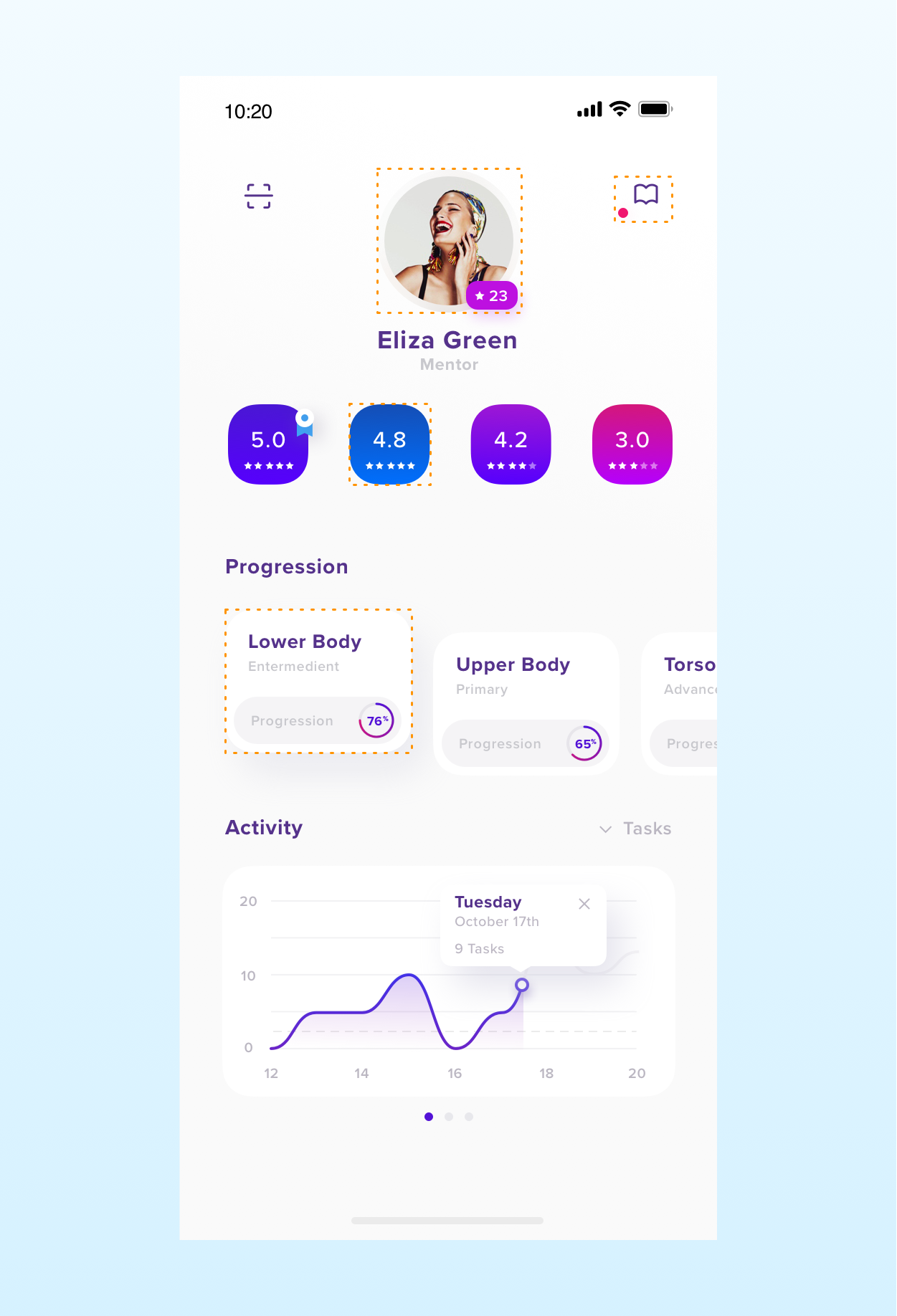
Credits: Maciej Dyjak on Dribbble
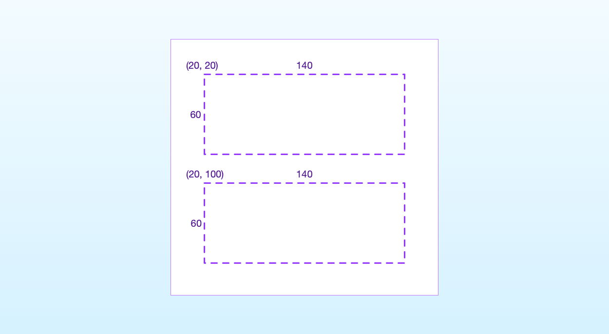
The rectangle of a view is called frame.
Frames are structures that represent rectangles. They have an origin, containing the x and y position of the top-left corner of the rectangle, and a size, providing the width and height of the rectangle.
These are all, of course, measured in points.
In Swift, frames value types coming from the Core Graphics framework.
Core Graphics is a low-level framework for 2D rendering, in which you find many structures used by UIKit.
These are the ones you need to care about:
CGFloat, which represents floating point numbers. Even though Swift has its ownFloatandDoubletypes, you need to convert those toCGFloatwhen working with UIKit. Luckily, switching between the two is not hard.CGPoint, which represents the x and y coordinates of a specific point in a coordinate system.CGSize, which represents the width and height of a rectangle.CGRect, which represents a rectangle in a coordinate system. This is the structure used to represent the frame of a view. The origin of aCGRectis aCGPoint, while its size is aCGSize.
You need to know what frames are even if you use Auto Layout.
As we will see later, in Auto Layout, you don’t change the values of frames directly. Sometimes though, you do need to read those values.
For example, you might need them values in your code. We will see an example towards the end of this article.
And often, when your layout does not work as expected, you need to read these values to debug your app.
The best approach to Auto Layout is to always start in Interface Builder
In iOS, you can build interfaces either in code or in Interface Builder.
In general, I am in favor of using the latter whenever you can. Developing user interfaces visually is faster and less error-prone. I wrote extensively about why in my definitive guide storyboards in iOS.
The same applies, of course, to Auto Layout.
When you use Interface Builder, you can often see the results Auto Layout produces without running your app.
Moreover, Interface Builder removes a lot of boilerplate layout code from your project. That’s code you have to review and maintain, so the less, the better.
I know that there are developers that avoid storyboards altogether.
Most of the time they do so just because of personal preference. I address all the objections to storyboard in the guide I linked above.
This is the best approach to simplify Auto Layout:
- Start in Interface Builder. It does not matter how sophisticated an interface is; I always start by doing as much as possible in Interface Builder. Even though IB does not tap into the full power of Auto Layout, it offers most of the functionality you need to cover a plethora of cases. This is usually enough for most, if not all, the UIs in my apps.
- Add code only when you reach the limits of Interface Builder. Even though there are things you cannot do in Interface Builder, this does not mean that you have to switch to code completely. Often, you can do most of the work in interface builder and complement it with a couple of lines of code.
- Use code only for particular, highly dynamic views. Sometimes you get to UIs so complicated that you need to rely on code heavily. That is rare, but happens, especially for UIs with complex user interaction and animations. In those cases, though you only need to code the behavior of specific views. You can still lay out the rest of the UI in Interface Builder.
In this article, I will cover the first two points. Many developers don’t realize how far they can go with the simple tools Interface Builder offers.
If you need a refresher or introduction on how Interface Builder works, you can have a look at this section in Apple’s Xcode guide.
As an example, we will build the UI for an app about books, inspired by the Goodreads website. I put the Xcode project the full Xcode storyboard and the code on GitHub.

Don’t be tricked by the simplicity of this UI.
Even if it looks simple, it will include all the complications of a real user interface.
Views are organized in a hierarchy and use relative coordinate systems
Views can contain other views. This organizes them in a hierarchy.
At the top of the hierarchy, there is the app’s window, which spans the whole screen of a device. This is an instance of UIWindow, but it’s also a view since UIWindow descends from UIView.
Inside the window, you find the views of your app’s view controllers. In iPhones, view controllers usually also span the whole screen, but that’s not always the case, especially on iPads.
But you don’t usually need to care about any of this. Containers manage that for you.
This means that the starting point when creating the UI of a screen in your app is the main view of a view controller. That’s where you place the buttons, label, images, etc.
We will start by placing a label there, as a starting point for our UI.

In Interface Builder you can access the frame of the selected view in the Size inspector. In code, you access it through the frame property of the UIView class.
Here there is an important point to keep in mind: each view has its own coordinate system. The origin of any subview is relative to the coordinate system of the superview.
So these values are relative.
This makes positioning views quite complicated. And indeed, that was the case in the past.
When you use Auto Layout, you don’t have to worry about coordinate systems and frames. You never set them directly. They are, instead, calculated by the layout system.
It’s useful to keep this in mind when you read frame values though, not to get confused. The origin of a frame is relative to the superview, not to the screen’s coordinate system.
Section 2:
Building and Previewing UIs in Interface Builder
Creating complex adaptive UIs can be tricky when you can’t see the result of that you do.
When writing apps, you have to go cycle through coding and running an app in the simulator, to see the results of the code you write.
Thankfully, Interface Builder in Xcode can access most of Auto Layout’s power, speeding up development.
Placing views in their final position and measuring distances
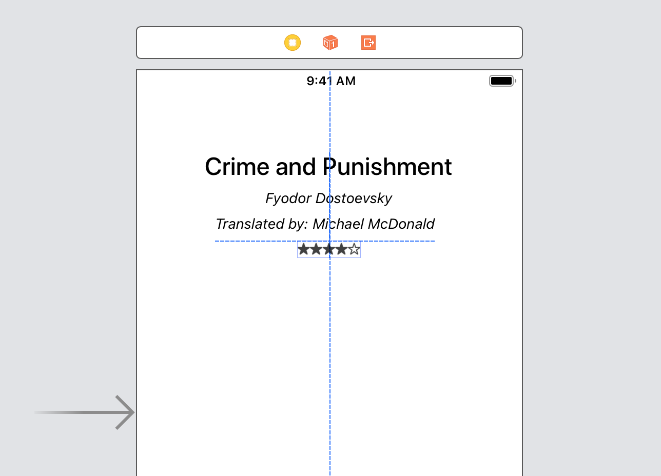
In our design, we have a few labels for the book’s title, author, translator, and rating. They all have different sizes and appearance.
Let’s go on and placing them all in our view controller.
It is useful to place any view in the final position you want it to have, at least approximately. This will help us to set constraints later.
As you drag views around, Interface Builder shows blue guides that help you align views.
You can set the text and the font of each label in the attributes inspector.
The stars are also contained in a label, using the ★ and ☆ Unicode characters. There is no need to complicate your life when a more straightforward solution works as well.
You can bring up the character viewer on your Mac by pressing ctrl-cmd-space on your keyboard. This works in any app.
If you select a view and hold down the alt key on your keyboard, you can hover the pointer over other views and get the distance between them.
This helps you position views accurately, respecting the values coming from your mockups. It will also help later to see if Auto Layout is placing views where you want them to be.
A fundamental piece of Auto Layout: the intrinsic content size of views
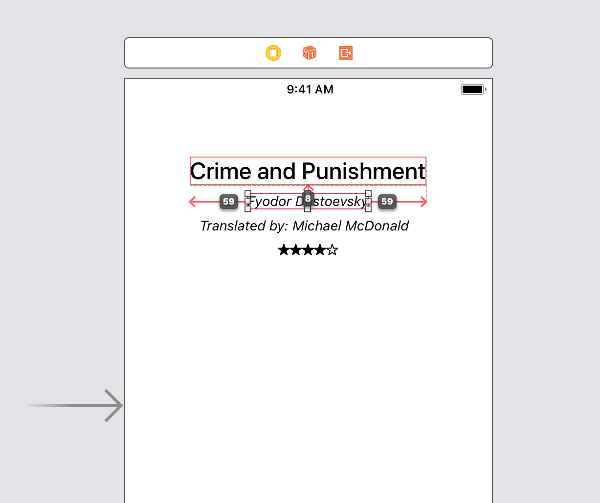
Notice that, as you set the content and the properties of a label, its frame adapts to the content.
This is the first important feature of Auto Layout, called intrinsic content size. It allows the layout system to determine the size of a view based on its content.
Always remember that it’s Auto Layout that determines the size and placement of views. So, it’s not the labels that are growing; it’s the layout system that is changing their size.
Views should not alter their frame. This applies to your custom views as well. The layout system always has the final say. Changing the frame of a view has no effect.
Through its intrinsic content size, a view gives to the layout system a piece of information. This is only one of the many used to calculate the final frame of a view.
Since in this case there is no other information yet, the intrinsic content size is the only factor at play. That will change later.
Only some views in iOS have an intrinsic content size.
A few examples:
- Labels, buttons, and images adapt to their content both horizontally and vertically.
- Some controls, like sliders, progress bars, and switches, only have an intrinsic height, but no intrinsic width.
If you create your custom view and you want it to adapt to its content, you can provide its intrinsic content size in code, overriding the intrinsicContentSize property of UIView.
You rarely need that and, depending on your content, calculating it might not be easy.
The intrinsic content size is an essential aspect of Auto Layout. You often want labels to adapt to their text, moving the rest of the UI as a consequence.
In other cases, you might want to prevent it. Images are an example since they might be too big and you don’t want them to mess with your layout.
Previewing the output of Auto Layout on different devices without running an app in the iOS simulator
We now have some nicely aligned labels.
Does this work on every screen though?
The default size for view controllers used by Interface Builder in Xcode 10 is the one of the iPhone 8.
This will probably change in the future, but the point is that we used a specific size as a reference when we aligned our labels.
We want to see how our UI looks on other devices too.
It is, of course, always possible to run the app on different simulators. But that’s tedious and time-consuming.
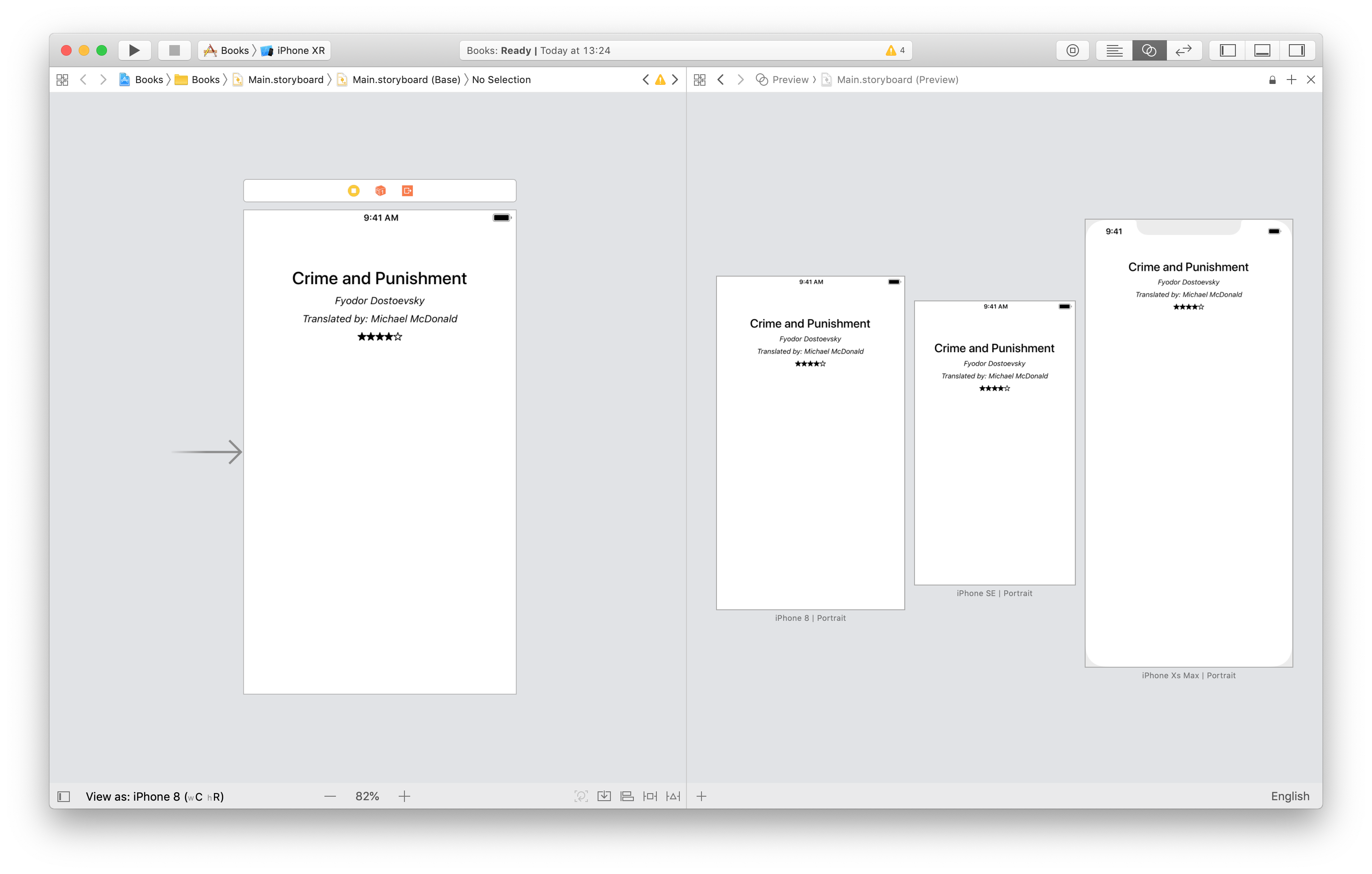
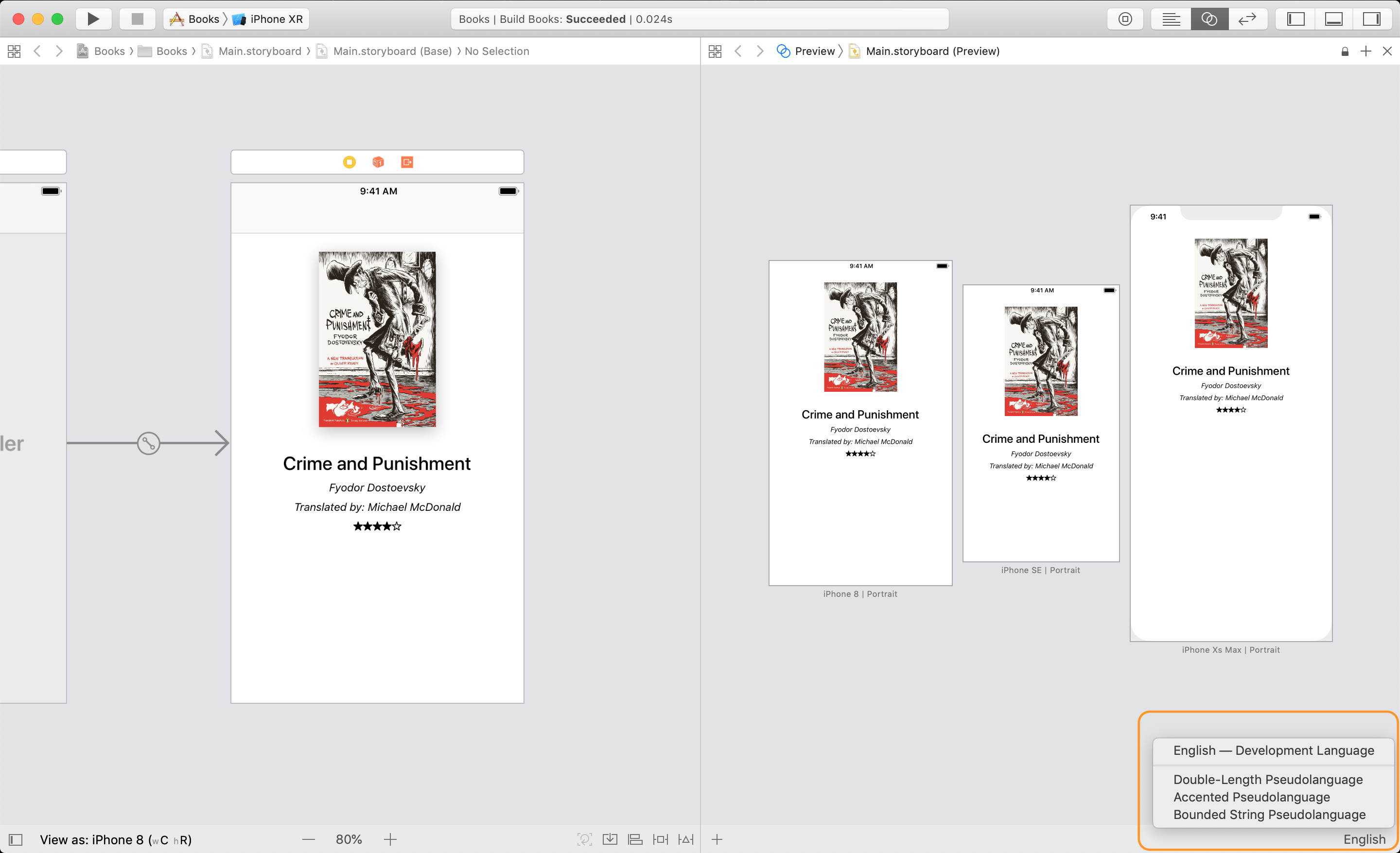
Luckily, Xcode has a preview mode that allows us to see a bunch of screen sizes at once, without building the project.
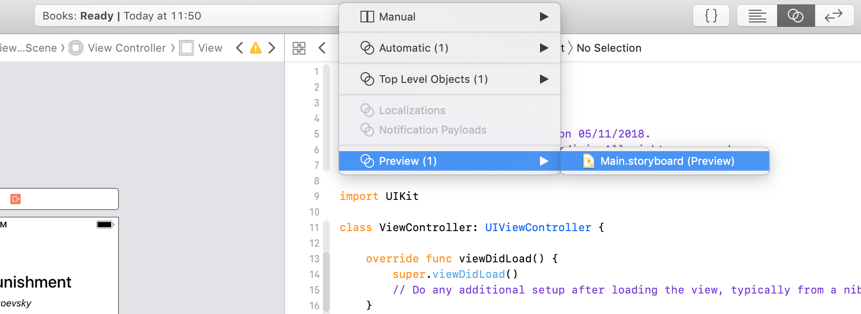
First of all, you need to bring up the assistant editor, by clicking on the button with two circles in the top-right corner of the Xcode window.
Then, click on the first segment of the jump bar of the assistant editor and select Preview -> Main.storyboard
This brings up the preview, which initially includes only a single screen size. You can add as many devices as you want by clicking on the + button in the bottom-left corner.
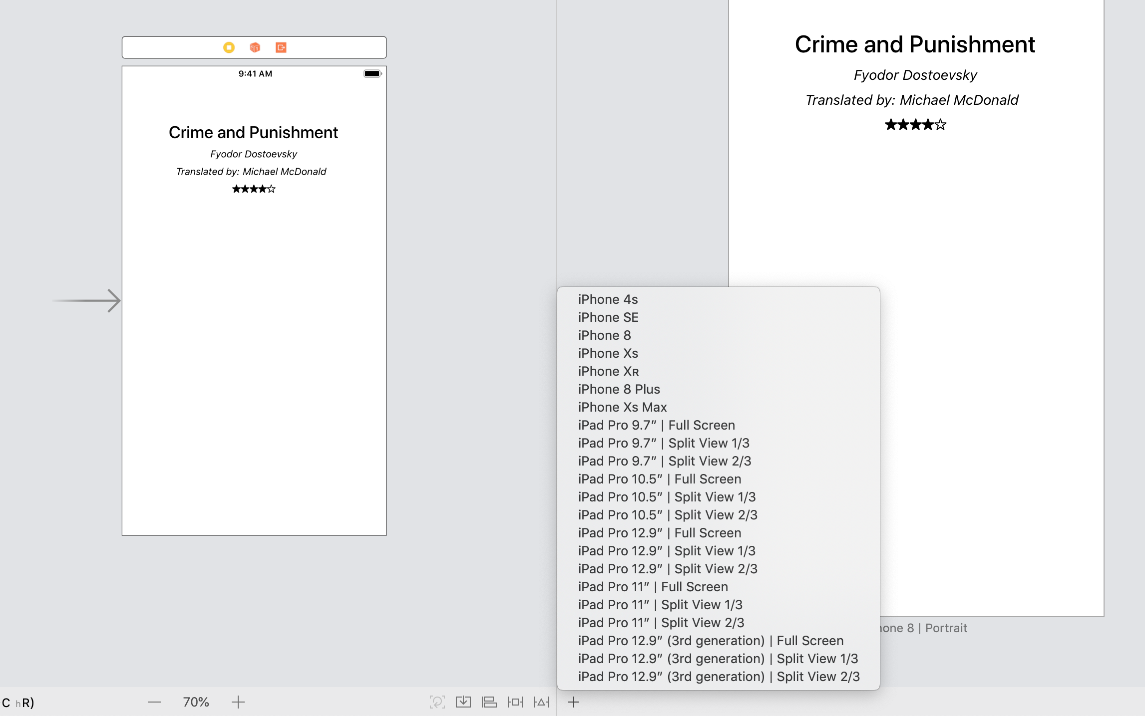
Let’s add a smaller device, the iPhone SE, and a bigger one, the iPhone Xs Max, to see how our UI looks on there.

It’s clear that our labels are not centered on any screen other than the one of the iPhone 8.
You probably got the reason already.
As I mentioned above, frames are static and do not change alone. It is the layout system that changes them, based on the information we provide.
Here, nothing tells Auto Layout to keep the labels centered. The blue guides we followed when we aligned the labels are there only to help you position your views. They do not carry any information for Auto Layout.
Views stay where you place them. While that makes them look centered on the iPhone 8, it does not work on screens with a different width.
When you use Interface Builder, Xcode warns you about Auto Layout issues
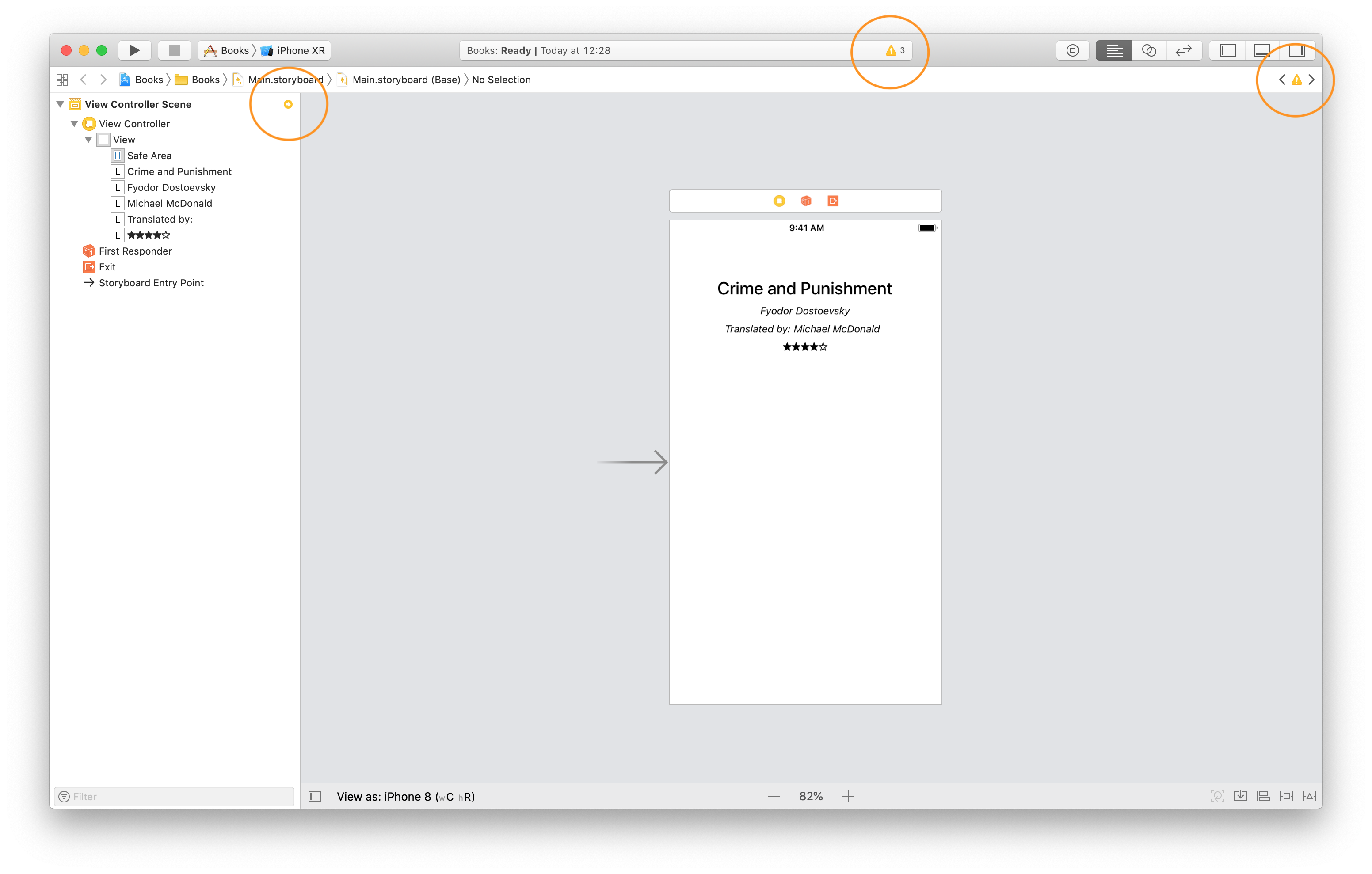
Xcode is already giving us some warning, as you can see in many places around its window.
This is one of the advantages of using Interface Builder. Xcode can detect some possible issues with your layouts.
That does not happen with Auto Layout code. In that case, you don’t get warnings until you run the app.
If you click on the yellow arrow in the document outline, you can see what these warnings are. To read the whole text of error messages, you can either drag and resize the document outline, or hover over an error message with your pointer.
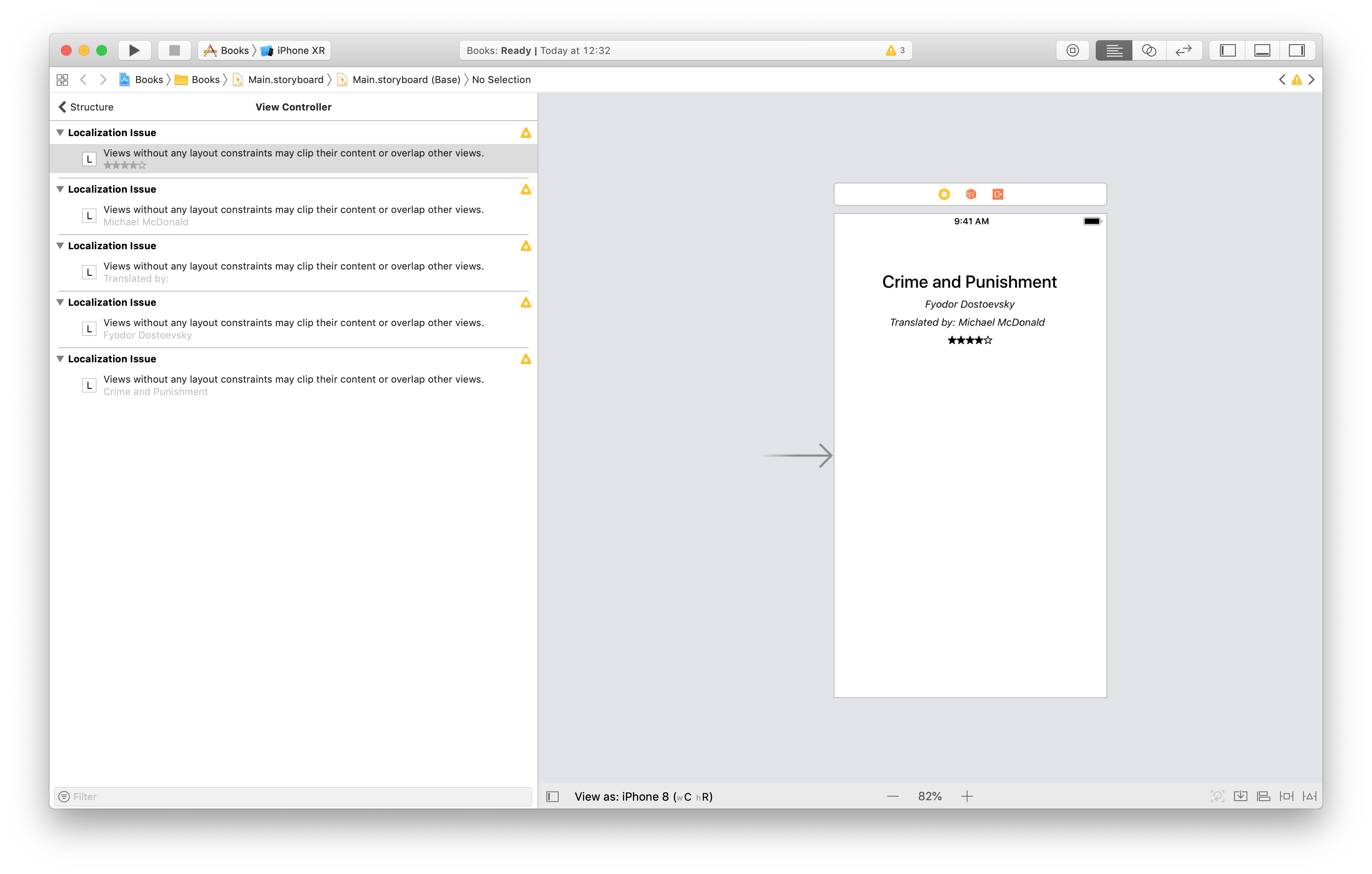
What Xcode is telling us is that, since these labels change size according to their content, they might overlap. These warnings mention localization because even static text changes for different languages.
You can click on each of the yellow warning icons, and Xcode will propose a solution.
I never use that, because the solution is often wrong. Xcode does not know what you are trying to achieve and will only add a bunch of random constraints to make the warning go away.
What these warnings can’t tell us is that our labels are not centered. Interface Builder does not know what we want to achieve.
So don’t expect to get warnings for every mistake you make. You can only be sure your layout works by previewing it in the assistant editor or testing it on the simulator.
Section 3:
How layout constraints transform your User Interface

Layout constraints are the core components of Auto Layout. They allow you to describe what the final result should be, instead of positioning and resizing views with complex code.
On top of that, Interface Builder allows you to set constraints directly on your UI, showing you immediate results and warning you about problems before you run your app.
Auto Layout constraints express relationships between the attributes of views
As we have seen, under Auto Layout, we don’t set the frames of views directly. The layout system calculates those according to the information we provide.
We do so by setting constraints on views.
While frames express our views’ absolute positions and sizes in a coordinate system, constraints express relationships.
Instead of defining the frames of views, with constraints you express concepts like “this view should always be this far from that other one” or “these two views should have the same size”.
To be precise, you don’t attach a constraint to a view itself, but to one of its attributes.
This isn’t that bit of a surprise.
If you think about it, when talking about the size of a view, we talk about its width and height. These are attributes.
When we specify the vertical spacing between two views, we do the same. What we are really talking about is the distance between the bottom of the top view and the top of the bottom one.
Unsurprisingly, then, the names of the attributes a view has are easily recognizable.
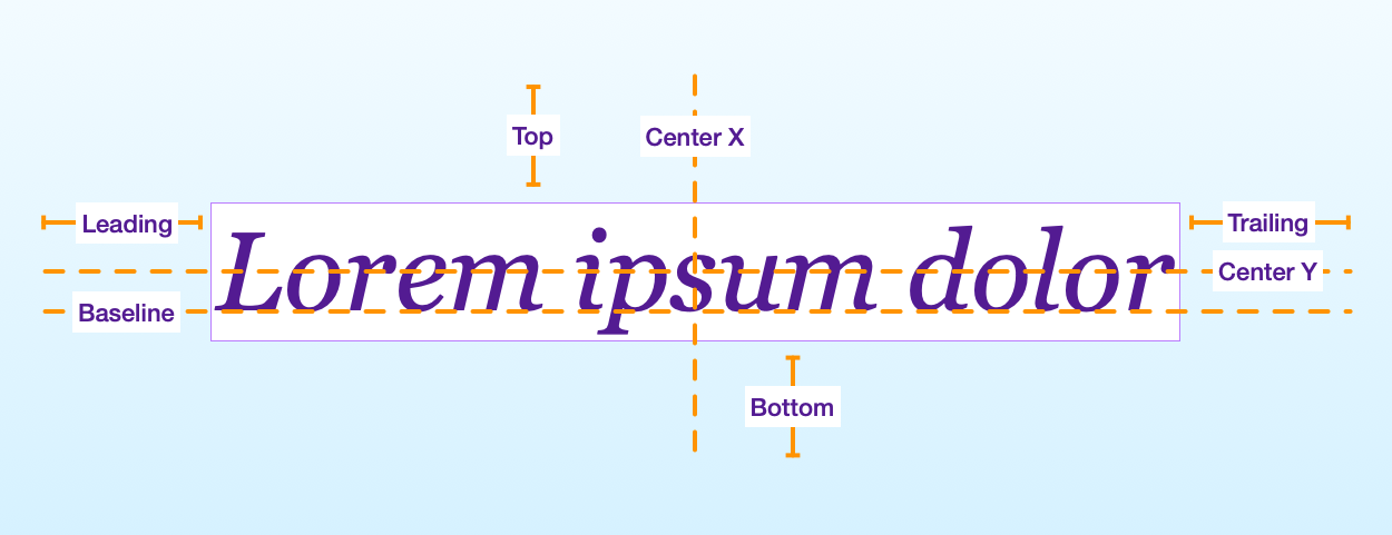
Each view has:
- One attribute for each side: Top, Left, Bottom, and Right, plus Leading and Trailing. These two represent the beginning and the end of a language’s reading direction( right to left or left to right).
- Two attributes for its size: Height and Width.
- Two attributes for its center: CenterX (horizontal centering) and CenterY (vertical centering).
- Labels also have a Baseline attribute. This helps to align labels according to the line on which their text is written. If you align labels along their top or bottom edges, their text is going to look misaligned.
Now that we have attributes, we can specify their relationships using constraints.
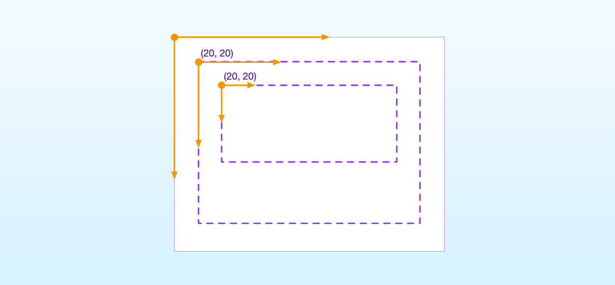
Under the hood, a constraint is a mathematical equation with the form:
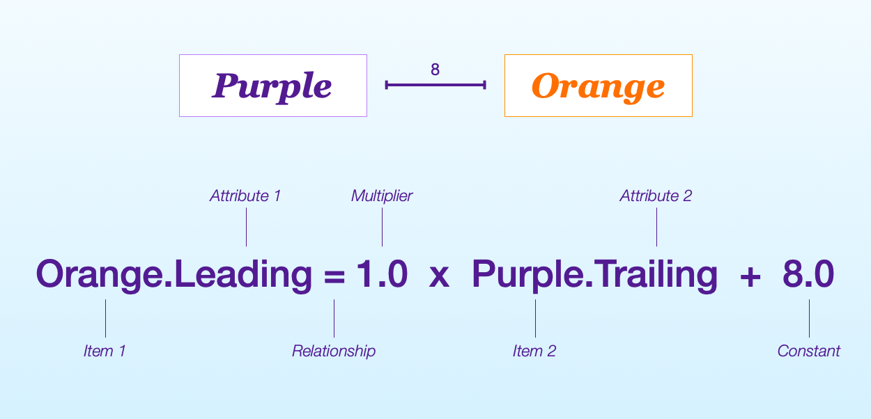
It’s important to understand what a constraint equation contains. Even in the graphical interface of Interface Builder, you are still setting the values of such equation.
- Item 1 and Item 2 are, generally, the two views on which you are setting a constraint. I say “generally” because they can also be layout guides, which we will see later in this article. If you are setting the height or the width of a view, you don’t need the second item. In that case, you set it to Not an attribute.
- Attribute 1 and Attribute 2 are the respective view characteristics to which a constraint is attached, from the list above
- The Multiplier is a number which allows you to express proportions. For example, you can use it for constraints like “the width of the first view needs to be twice as long as the height of the second one.” Often you don’t need to set proportions, so the multiplier’s value is usually 1.0.
- The Constant is a number that represents the absolute length of a constraint. You use it to either set distances between views or their size. For example, it allows you to express constraints like “the top of the first view needs to be eight points away from the bottom of the second one”.
- Finally, the = sign is the Relationship. Equality is the most common relationship, but not the only possible one. You can also use to ≤ or ≥ to express “at least” and “at most” constraints.
Most of the power of Auto Layout resides in setting the values of each constraint correctly.
It takes a while to get accustomed to thinking in terms of constraints. But when you do, you can go a long way. Setting the multiplier, the constant and the relation of a constraint equation properly allows you to create complex layouts.
Most of the time though, you need simple constraints, and you can create those easily in Interface Builder. That’s what we are doing next.
Centering and aligning views along a common attribute
As we have seen, the blue guides in Interface Builder are only there as a hint.
If we want our labels to stay centered on any screen, we need to add some constraints to them.
There are two different ways to create constraints in Interface Builder. But before we get into that, there is an important thing you need to know, which many developers ignore.
You can set constraints between any two views, regardless of their position in the view hierarchy.
It is common to set constraints between:
- a view and its superview;
- two views contained in the same superview;
But you can set a constraint between any two views you see on the screen. It does not matter of their parents are siblings, or one is inside the other’s hierarchy.
Auto Layout works across view hierarchies. This is another of the subtle details that make complex configurations possible.
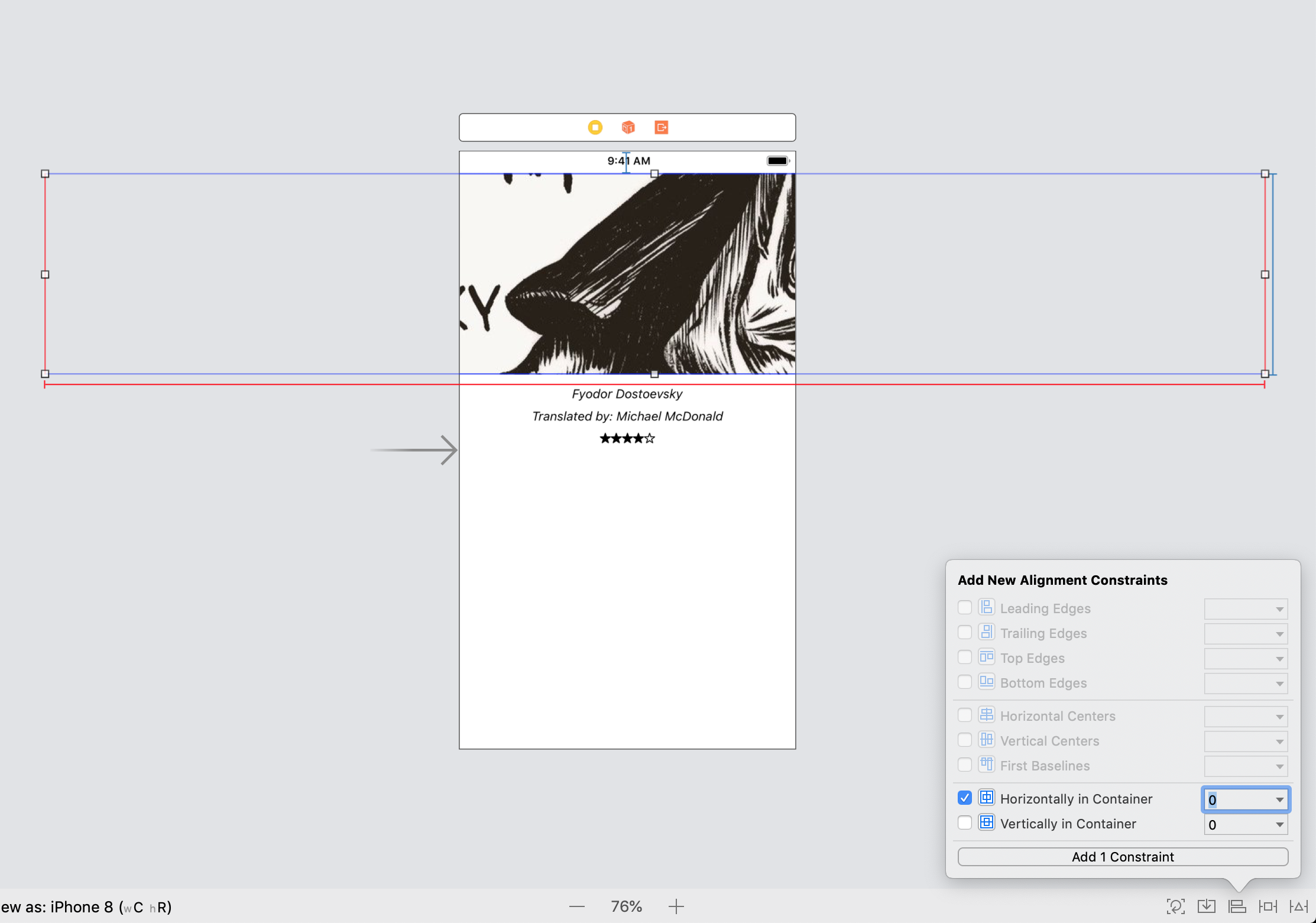
Let’s get back to our labels.
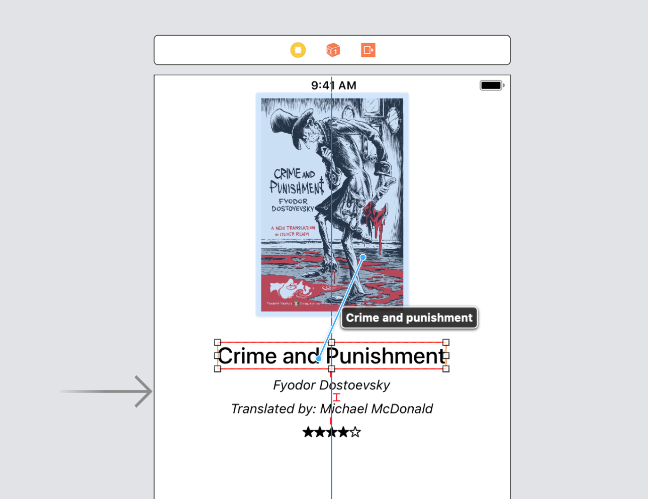
We want them to remain centered across different devices. For that to happen, we need to constrain their CenterX attribute, which needs to be aligned to the CenterX attribute of the view controller’s view.
The first way to set a constraint between two views in to use the menus in the bottom-left corner of the editor. Since we want to center our labels, we need the Align menu.

This menu allows you to align views along the same attribute for both views. So you can align views along either of their sides or their centers.
We only selected one label, so the only options we have is to center the view inside its container.
That’s precisely what we need. Check the Horizontally in Container option and then click on the Add 1 constraint button.
If you want to offset the center of a view by some length, you can enter a number in the text field next to the checkbox. But we don’t need to since we want our label to be perfectly centered.
Here you see a first example of why placing views in their final position makes your life easier.
These panels are pre-filled with the current values of the selected view. If a view is where you want it to be, you only have to check the right checkbox to add the constraints you need.
You don’t have to set constraints one by one though.
You can also select multiple views and set a bunch of constraints at once. For example, we can select all our labels and center them in one go.

You can’t set a constraint between four views at once. Remember that a constraint only has two attributes. So, the result here is that three constraints are added at once, as the Add 3 Constraints button says.
Notice that here we have two options to center all our labels.
We can center them all inside their container or align them with each other. Both options produce the same result, but there is a subtle difference.
Here I selected the second option. Since the label at the top is already centered in the container, all other ones will also be centered.
We can open the preview again, and see that our labels remain centered on all iPhones.
So, what’s the difference between these two options?
The one I selected makes all labels follow the first one. If you later need to move all labels left or right together, you only have to change the constraint on the first label. All other labels will follow.
That, of course, depends on the final result you want. If you need to move labels independently, then centering them in their container is the best option.
The lesson here is that there are often different ways to achieve the same result.
In general, you need to pick the simplest one. The differences are often irrelevant. In our example, you rarely move centered labels, so the two solutions are equal.
At other times though these nuances become essential.
That is left to your judgment. Unfortunately, sometimes you don’t know, and you have to pick an option, only to realize later that you have to remake your constraints.
Starting with clear design specifications can help you pick the right option. Experience on many projects has taught me not to create complex layouts until I get the final mockups from the designer.
Even in that case, designs often change. That’s just the life of a developer.
Why Auto Layout complains about missing constraints and how to space and distribute views
Even though our views are now centered, Xcode seems to be complaining about something else.
When you select any label, its frame rectangle is now red instead of blue. The document outline also shows a bunch of red warnings.

All these warnings are about missing constraints.
What Need constraint for: Y position means it that we aligned our labels horizontally, but we did not set any vertical constraint. So Auto Layout does not know how to place labels vertically in the view.
But why is it complaining only now? We didn’t get any warning until now.
This is a hidden peculiarity of Auto Layout. If you don’t know this, it can get frustrating.
Recall that the frame of a view contains two pieces of information: the origin and the size. Auto Layout needs constraints for both to position a view correctly.
When you don’t provide them, Auto Layout sets some constraints automatically. These constraints keep the frame constant, as we saw at the beginning.
But when you provide half of the information for either the origin or the size of a view, Auto Layout wants the other half too.
Until now, we didn’t alter the origin of our labels, so Auto Layout used the initial frame coming from Interface Builder. Now that we set their horizontal position, Auto Layout wants the vertical one as well.
In this case, we need to space our labels vertically. To set distances between views, you use the Add New Constraint menu.
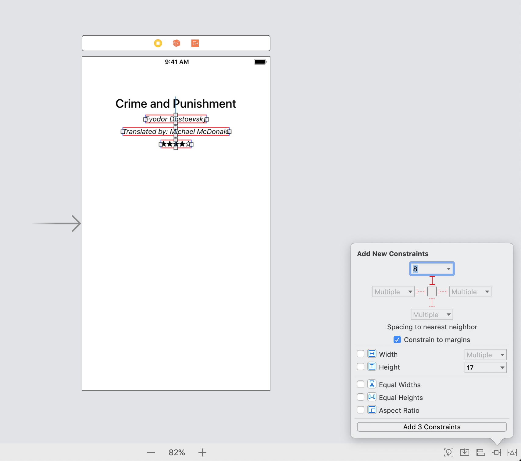
As above, you can either select one label at a time, or multiple ones at once.
All our labels have the same spacing, so we can set all these constraints at once. All you need to do is to select the constraint you want, by clicking on the corresponding dashed bar in red.
This is again made simpler by the fact that we previously put our labels in their final positions. So, the length of our constraints is already pre-populated in the panel.
It’s typical for views to have the same spacing when you work with a designer that uses an 8-point grid. The blue guides in Interface Builder that help you align views also use it.
If you design your apps by yourself, my advice is to follow the 8-point grid.
Fixing the height and width of views with absolute constraints
We added adding spacing constraints between our labels, but the warning are still all there.
What is going on?
The reason is that Auto Layout still does not have enough information to position the labels along the vertical axis.
That’s because we still did not set the vertical position of the first label. All the constraints we added are relative. The second label depends on the first, the third on the second, and so on.
In our mockup, we have an image for the book’s cover at the top of our screen. So let’s drag our labels down and make space for an image view.

If you accidentally move the labels off the center when dragging them, Xcode will color orange the constraints you are not respecting. It also shows where Auto Layout will place the labels using dashed, orange rectangles.
You can click on the Update Frames button, in the bottom-left corner of the editor, to move the views to their correct position.
Let’s now add the cover image.
First, you need to add the image to the asset catalog of the Xcode project. Then you can drag it into Interface Builder from the media library.
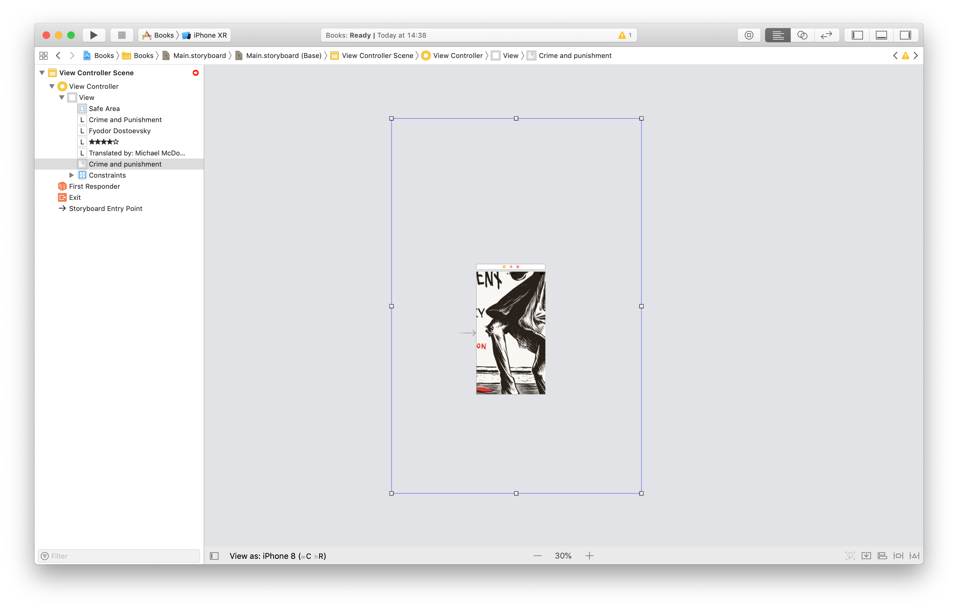
Now we have a problem. The image is too large.
Image views also have an intrinsic content size. Auto Layout resizes the image view to adapt to the contained image, making it go out of the view controller’s boundaries.
The solution is not to resize the image file in the asset catalog. We need high-resolution images for big devices with retina displays.
Instead, we need to constrain the size of the image view. Constraints do not only express relationships between attributes but can also be used to set absolute values for a view’s size.
We can use the Add New Constraints menu to set the width and the height of the image view. We can also pin its top to the top of the container at the same time.
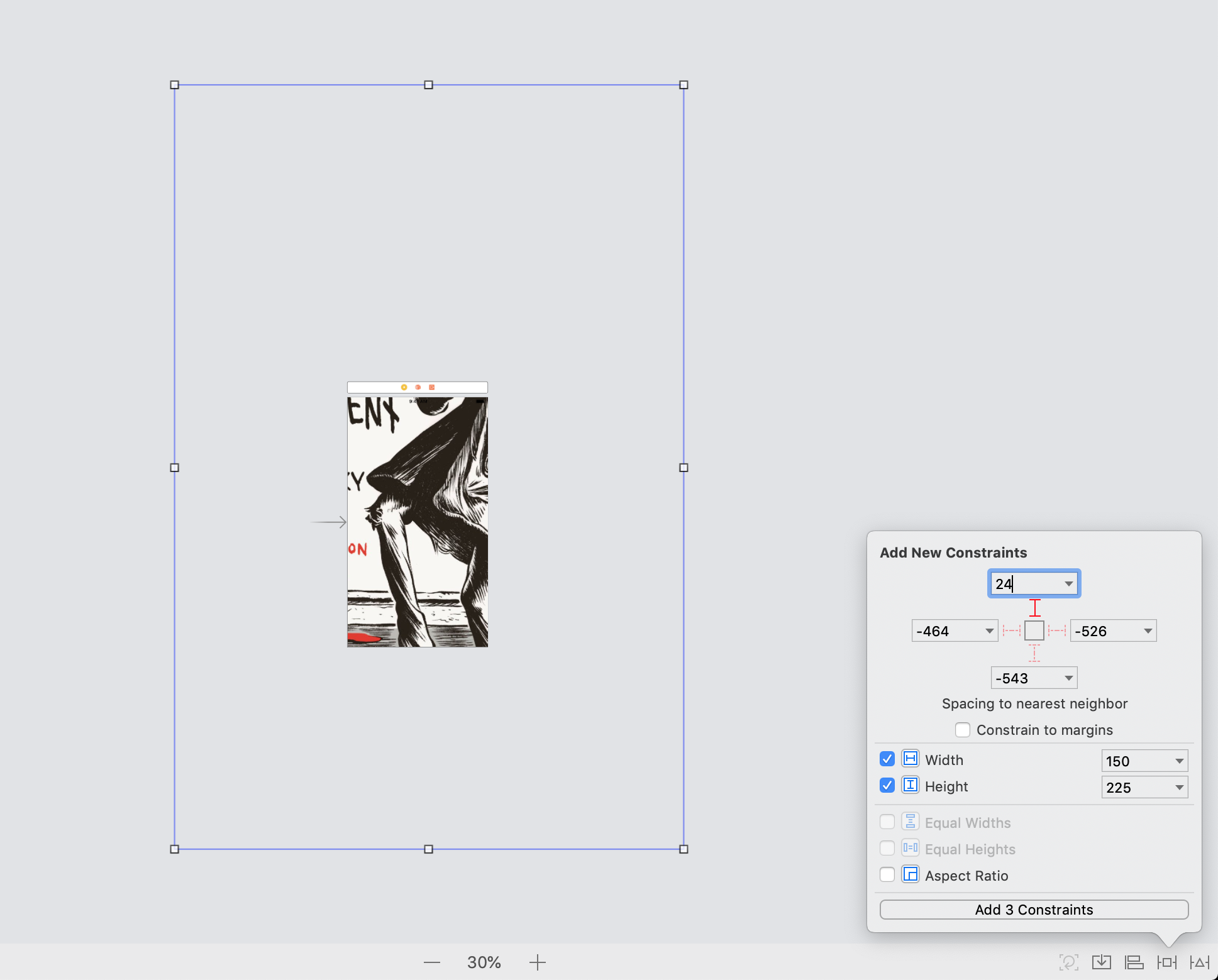
That’s not enough.
We have provided both pieces of information for the size, but only one for the position. So Interface Builder misbehaves.
You are not guaranteed to get the same result you get in the screenshot below. Auto Layout is quite complex internally. It behaves consistently only when your constraints are clear and complete.
To fix the problem we need to add the missing piece: the horizontal positioning. We use again the Align menu to center the image view in its container.
The cover image, though, does not adapt to the size of the image view.
That depends on the Content Mode of the image view. In this case, we have to set it to Aspect fit to make adapt to the image view boundaries without being deformed.
We are missing one last constraint.
We need to set a fixed vertical distance between the book cover and the title.
For this constraint, I will show you the second way to set constraints in Interface Builder.
As usual, start positioning the labels in their final position. Then ctrl-drag from the top label to the image view (or vice-versa, the order does not matter).
When you release, a contextual menu appears, with a list of constraints. The one we need is Vertical Spacing.
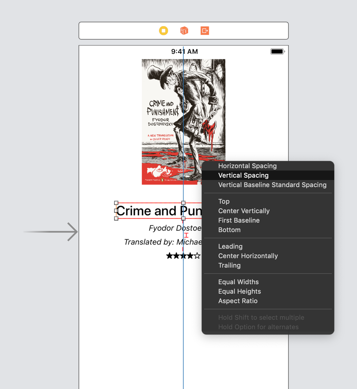
For some reason, you might sometimes not get all the possible options in this menu. The solution is to control–drag diagonally when possible.
Some developers say it’s a bug, but it might as well be a “feature.” It looks like Interface Builder only shows the constraints relevant to the direction of the dragging. That’s why dragging diagonally solves the problem.
Section 4:
Keeping Views Well-Positioned on the screen of any iOS Device

In 2017, Apple introduced the iPhone X.
Unlike previous generations, this new model sports a screen with an irregular shape. The corners are now rounded and the device has a notch at the top, containing various sensors.
The screen extends under the notch and the corners. When we lay out an interface, we have to make sure that our views do not go too close to these new screen features.
And that’s not all. We also have to avoid the navigation bar at the top of the screen, and the tab bar at the bottom.
Views with irregular shapes can look larger than their actual frame
Our mockup has a nice shadow around the cover. Let’s add that to our app.
Visual niceties like rounded corners or shadows require code that affects the layer of a view.
Layers are a concept coming from Core Animation. In short, every view has a layer, which is where the drawing of the content happens.
Views are always rectangular. If you want a view to have a different shape, you have to affect its drawing, i.e., its layer.
Layers are beside the point of this article since they are do not take part in Auto Layout. You can find more about Core Animation layers here.
Luckily, the code is not so hard.
class ShadowedImageView: UIImageView {
	required init?(coder aDecoder: NSCoder) {
		super.init(coder: aDecoder)
		setUp()
	}

	override func prepareForInterfaceBuilder() {
		super .prepareForInterfaceBuilder()
		setUp()
	}

	func setUp() {
		layer.shadowColor = UIColor.gray.cgColor
		layer.shadowOffset = CGSize(width: 0, height: 5.0)
		layer.shadowOpacity = 0.5
		layer.shadowRadius = 10.0
	}
}
I made the ShadowedImageView class @IBDesignable, so it shows directly in Interface Builder. I talk more about designable views in this article on iOS Storyboards.
But even after setting the ShadowedImageView class in the Identity inspector for our image view, the shadow does not appear.
The solution is simple, but if you don’t know it, it can make you waste a lot of time looking in the wrong places.
What happens is that the shadow drawn by the layer goes out of the view’s boundaries. By default, views clip their content, to prevent it from spilling over other views.
So, the solution is disabling clipping. You can do that in Interface Builder, by unchecking Clip to Bounds for the image view in the Attributes inspector.

After disabling clipping, you should see the shadow appear in Interface Builder. Sometimes though, the Interface Builder renderer crashes.
If you get a Failed to render and update auto layout status, The agent crashed error, have a look at this Stack Overflow question.
The lesson here is that the frame of a view defines its size and position, but does not have to restrain its content. It does so only when clipping is enabled.
This is how you create views with irregular shapes. You can make the drawings go outside of a view’s boundaries, but its frame is always going to remain a rectangle.
This allows you to set a specific size for a view through while allowing it to look bigger than it is. It can help you in some advanced layouts, where views seem to overlap, but you want their interactive surface to be limited.
Using the safe area to avoid the iPhone X notch, rounded screen corners, and container bars
While our UI is nicely laid out, it still not ready for prime time.
Let’s have a look again at the Interface Builder preview.

Since the iPhone X, devices have a notch at the top of the screen, which contains an array of sensors. You need to keep that in mind when laying out the content of a view controller.
As you can see in the preview, the notch partially covers the book cover.
And that’s not all.
In our mockup, this screen has a navigation bar at the top. That’s because, as it’s often the case in iPhone apps, this view controller is embedded in a navigation controller. I talk more about the various type of containers here
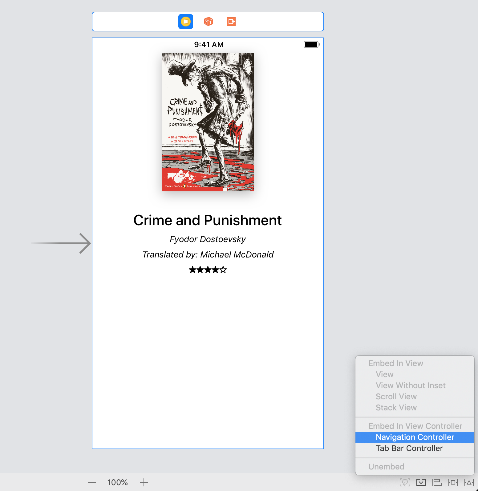
Let’s see what happens when we embed our view controller in a navigation controller. You can do so quickly using the Embed In menu in the bottom-left corner of the editor.
This makes things even worse than before.
Even without using the preview, we can see in the editor that the navigation bar covers the book cover even on iPhones without the notch.
For a long time, I had the instinct to blame Interface Builder. But don’t fall for it. IB is rarely wrong. If you run the app, the problem does not go away.
The problem is that we attached the image view to the top of the view controller’s view.
In iOS, view controllers extend below bars and the notch. They even extend below the rounded corners of new iPhones and iPads. This means that your content can go below any of these.
To make your content stay away from these elements, you need to use the safe area. This area is always visible because it always accounts for the notch, rounded corners, and bars, either at the top or the bottom of the screen, even when you rotate a device.
So, there is no need to write code to account for these cases. All you need is to attach constraints to the edges of the safe areas instead of those of the view controller.
Attaching layout constraints to layout guides and conflicting constraints
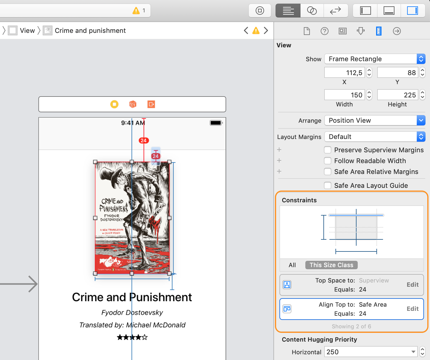
To make our book cover avoid the navigation bar, we need to attach its top constraint to the safe area.
In Auto Layout terms, the safe area is a layout guide. Layout guides are invisible objects that help you position your views. Like views, they have attributes like Top, Bottom, Left/Leading and Right/Trailing to which you can attach constraints.
Beware that you can’t use the Add New Constraints menu to edit a constraint. This is a point that causes a lot of confusion to developers that approach Auto Layout for the first time.
As the name of the menu suggests, this will add new constraints instead of editing the existing ones.
In Auto Layout there is no limit to how many constraints you can add between two attributes. And indeed, in highly-dynamic complex layouts, you sometimes need to do so.
Let’s see what happens when we do that.
Let’s move down all the views and bring up the Add New Constraints menu. There we can select the safe area as an option when adding a new constraint, by clicking on the small disclosure indicator in the corresponding text field.
That’s what we should have done when we added the constraint at the top of the image view.
Doing that now adds a second constraint. When we do so, Interface Builder complains again, marking the two top constraints in red.
That’s because these two constraints are conflicting. This means that they contradict each other and cannot be satisfied at the same time.
One needs to go away.
Auto Layout tries to degrade gracefully at runtime, so it won’t crash your app because of conflicting constraints. What it will do instead is remove the conflicting constraints one by one, until it can satisfy all the ones that are left.
The problem though is that the layout system usually does not break the right constraints, making your interface misbehave.
Luckily, this is a problem you only have when you add constraints in code. Interface Builder always warns you about conflicting constraints before you run your app.
Deleting and editing existing constraints in Interface Builder
You can edit and delete constraints in Interface builder like you do for any other object.
You can select a constraint by clicking on it directly, but constraints are thin and a bit hard to hit with the pointer. That becomes harder when you have many views and constraints in a view controller.
A quick solution is to zoom-in into your storyboard. If that does not help, you can use the Size Inspector. There you find a Constraints panel, that shows a list of all constraints.
In the small visual representation of a view, you can see a blue line for every attribute to which a constraint is attached.
If you click on one of these blue lines, it will filter the list of constraints below to show only the ones for a specific attribute. This helps in selecting a constraint when you have too many.
Once you select a constraint, hit Delete on your keyboard to remove it. In this case, we can remove the constraint to the top edge of the view controller, since we attached a new constraint to the safe area.
If instead, you want to edit an existing constraint, you can click on the edit button. That brings up a small contextual menu with some attributes you can change, but those are limited.
To see all the editable attributes of a selected constraint, you have to use the Attributes inspector instead.

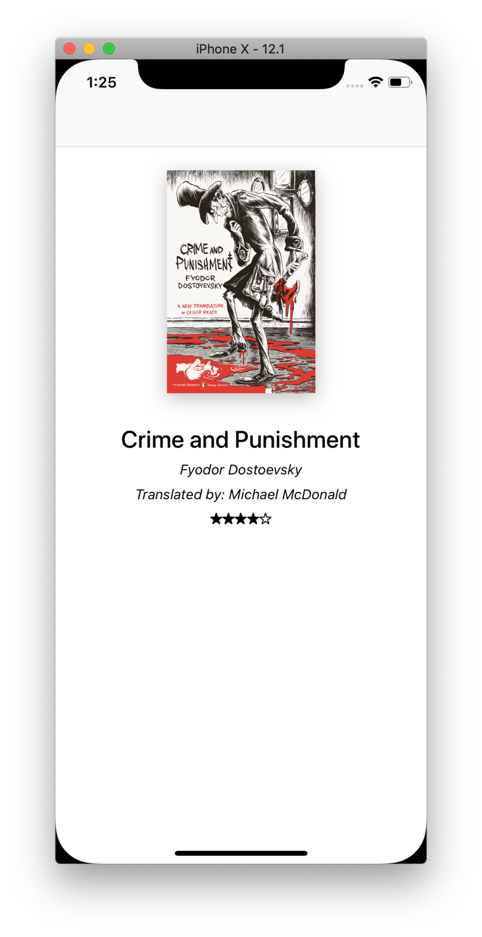
Here you can edit all the parts of a constraint I listed above. Our UI now adapts nicely to any iPhone size and the navigation bar.

Unfortunately, the Xcode preview is not very sophisticated and does not show bars or designable views. To see the final result you have to run the app in the simulator.
Section 5:
Adapting your Layouts to Dynamic Content
Many views in a view controller change size according to their content. This causes all the views in the user interface to reflow dynamically.
When views expand unrestrained, they can go out of the screen edges. It is then important not only to position views accurately, but to consider how dynamic content will transform them at runtime.
Previewing the size of views with static and dynamic text in the Xcode preview
The content of our view controller nicely adapts to all screen sizes. It remains centered and avoid the notch and the bars staying in the safe area.
But our content is static.
Obviously, in a real book app, we want to show the details of many books and not just one. When the content changes, our UI needs to adapt to it dynamically.
But dynamic content is not the only thing that can change the size of views.
All the content in our example is dynamic, but a regular app would use a mix of static and dynamic content. For example, a buy button would always say “buy” regardless of the book you are buying.
You usually don’t need to worry about static content, because, well, it’s static and does not change.
Until you localize your app for other markets.
Different languages have different lengths. Words in English are pretty short on average. Languages like German have much longer words.
That means that all your static text becomes dynamic. You can’t rely on it having a constant size.
Luckily, Xcode offers a tool to test dynamic text for different localizations without writing a single line of code.
In the bottom-right corner of the Xcode preview, there is a button that says English (or whichever the primary language for your app is).
Yes, that’s a button even if it looks just like text. If you click on it, it brings up a menu where you can pick different localization options.
If you select Double-Length Pseudolanguage, the Xcode preview will double the text in each label (and capitalize it to make it bigger).
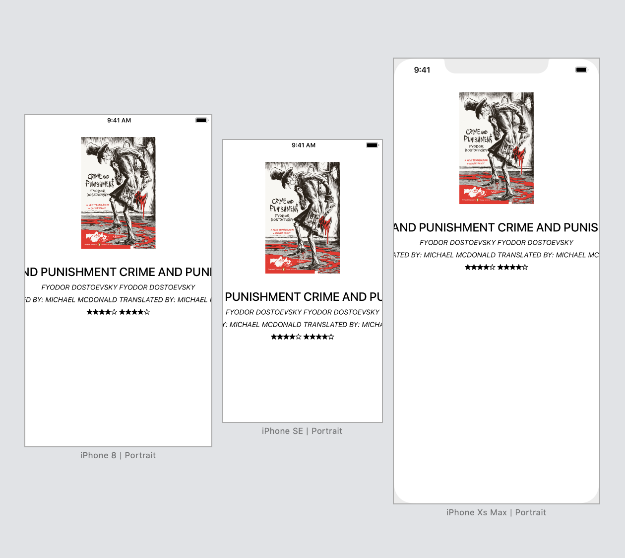
It’s now evident that our labels can grow past the screen’s boundaries when the content is longer than the static one we are using.
Using margins to keep content away from the edges of a view controller
To prevent our labels from spilling over the screen’s boundaries, we need some more constraints.
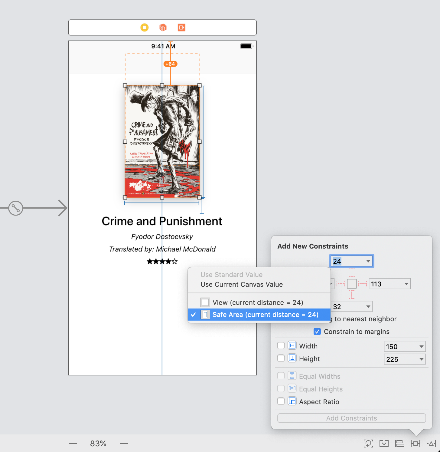
We already have 24 points margin at the top. It is a good design practice to keep all margins consistent, so we will use the same margins on each side of the screen.
Now, we could create those margins by adding new constraints on each side of our labels with a 24 points constant. That would work fine.
But what happens when our designer comes back with a new version with 32 points-wide margins?
You would have to go track all your constraints and change their constant from 24 to 32. That’s a bit tedious and error-prone. If your app has many screens, even more so.
Luckily, there is a better way.
Every view in iOS has margins. Margins are layout guides, like the safe area, to keep content at a specific distance from the edges of a view.
You can set the margins of a view in Interface Builder and affect all the constraints attached to them.
You set the margins of a view in the Size inspector. They come with a Default preset, which sets them at 16 points. As you can see, Apple uses an 8-points grid too.
To set your custom values, you have to change the Layout Margins property to Language Directional or Fixed. These follow, respectively, the Leading/Trailing and the Left/Right attributes of their view.

As I mentioned, it’s common to have all margins have a consistent value, so I set them all to 24 points. But you can give them separate values if required.
Notice that the Safe Area Relative Margins option is selected by default. That’s needed to make the margins adapt to the safe area.
With that option, your margins will stay inside the safe area, so you don’t have to worry about it.
Pinning views to the margins of a view controller
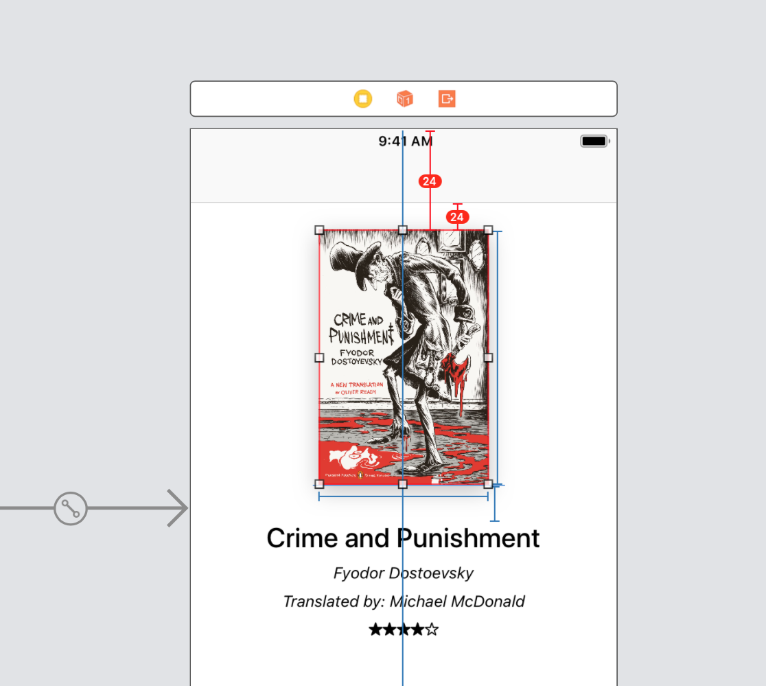
We can now pin our content to the margins of the view controller.
Let’s start with the book cover.
At the moment, the top of our image view is attached to the safe area layout guide. We don’t need to delete that constraint. We can just change its attributes.
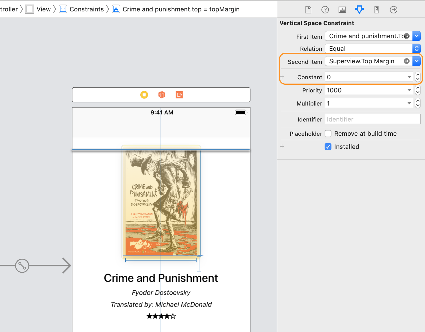
Here is what I changed:
- The Second Item property of the constraint was Safe Area.Top. I changed it to Superview.Top Margin.
- The constant was 24, and now it’s 0. When you use margins, you usually set the constants of all constraints to 0.
The final result, in this case, does not change. The cover image remains 24 points away from the safe area. But now we can change the view’s margins to move the image view vertically. All the other views attached to it will follow.
Let’s now take care of our labels.
We don’t have any constraints here yes, we need to add new ones. For that, we use the Add New Constraints menu again.
Unfortunately, in this case, we can’t set all our constraints at once.
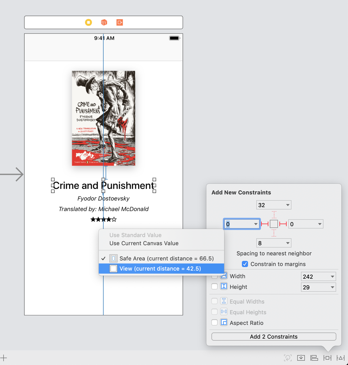
As you can see in the image above, we need to select the View option from the drop-down menu instead of Safe Area. When you select more than one view to add a bunch of constraints, those options do not appear in the list.
The constant of our constraints is again 0. More importantly, the Constrain to margins checkbox needs to be selected, or we would attach the constraint to the view’s edge.
This option is selected by default, which means that Apple wants us always to use margins.
After we repeat this for each label, the result is still not what we want.
The label’s text is left-aligned. But that’s not our main problem.
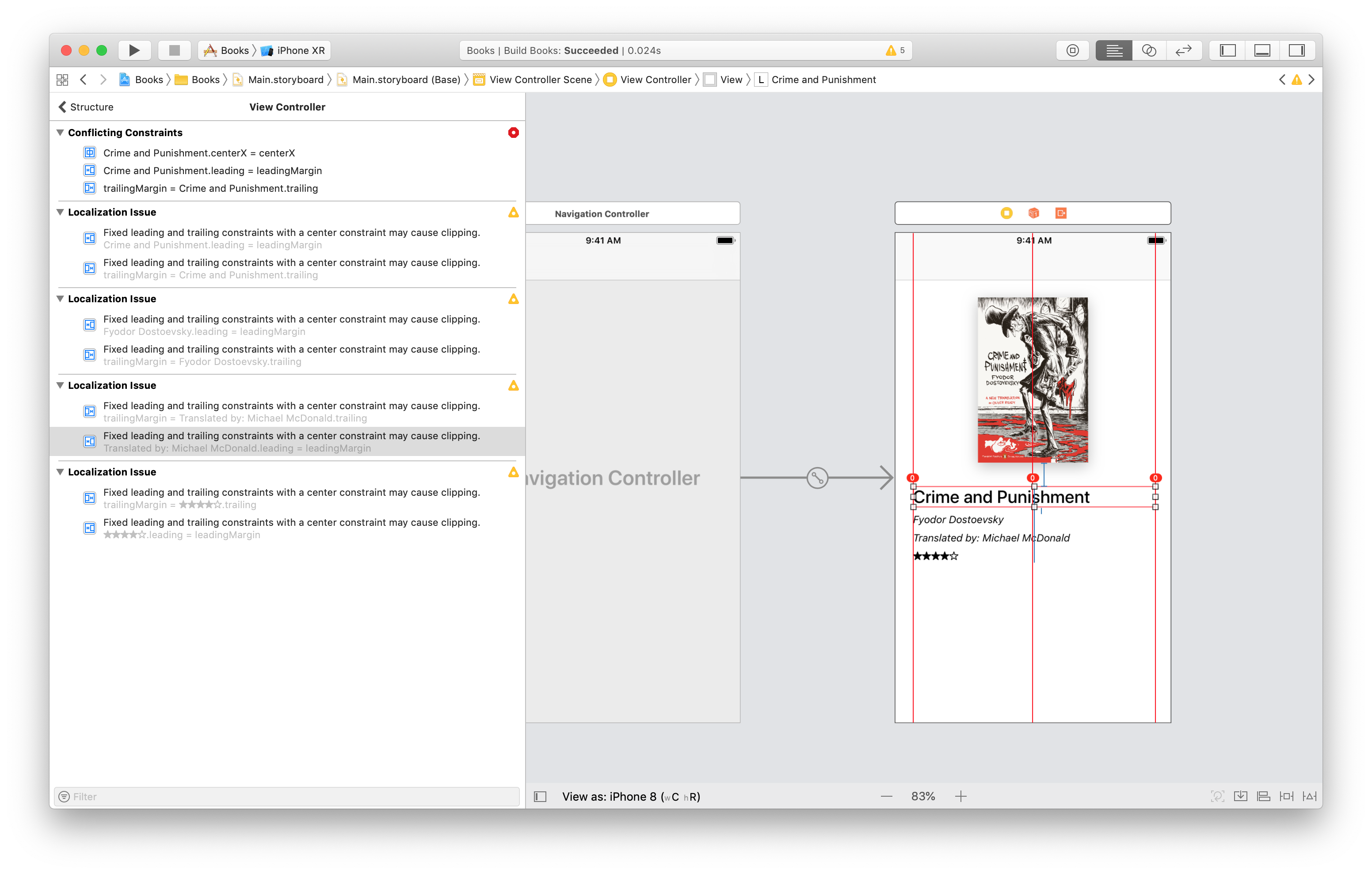
Looking at the Localization issues, Auto Layout seems not to like labels that have both a center constraint and fixed leading and trailing constraints.
And that’s not all.
The first label seems to have conflicting constraints. But the ones listed in the error message are not unsatisfiable.
The real problem is, instead, that we centered all the other labels according to the first one.
Somehow, all these new constraints together create a conflict.
Allowing views to expand while remaining within the borders of their container
Looking at the Xcode warnings, the solution seems straightforward: remove the centering constraints.
Since our labels now extend as far as the margins, we can keep their text centered by setting the alignment of each label to Center.
That would work, and probably it’s what I would do to solve this problem. It’s a good practice to go for the simplest solution that requires the smallest number of constraints.
But we are going to use another solution which you will need in more complex layouts. This will also expose another essential aspect of Auto Layout.
Our new constraints are making our labels as wide as the margins. That’s not exactly what we had in mind.
Instead, we wanted the labels to expand until the margins, but not further.
That seems the same, but it’s slightly different.
In the first case, labels keep a fixed size all the time. In the second, they are as small as possible, expanding only to adapt to their text.
In our current example, both options produce the same visual result. But there are cases in which you want your views to:
- always wrap around their content and only expand as much as possible; and
- not expand further than the margins (or some other limit in your UI).
You need this for views that have with a solid background or visible borders.
Buttons and image are an example. If you pull their edges away from their content, a colored background or solid borders will produce an ugly result.
Adapting the relation of layout constraints to avoid conflicts
We want our labels to expand according to their content but keep within the margins. But our constraints are pulling their edges to the margins.
That’s because our constraints define the distance to be equal to 0. When labels are within the margins, such range is greater than 0.
Recall from the beginning that the relation of a constraint can also be either ≤ or ≥.
And indeed, setting the Relation of all our constraints from Equal to Greater Than or Equal does the trick.

The conflicts went all away.
Constraints with a less than or greater than relation are more accommodating to other constraints. This reduces conflicts.
In our example, we have several constraints working together along the horizontal axis of our labels.
These are:
- The constraint centering the title label to its container.
- The three constraints centering other labels according to the title.
- The four intrinsic content sizes of each label.
- The eight constraints pinning the edges of our labels to the margins of their container.
That’s a total of 16 constraints, which need to be satisfied at the same time. Naturally, as the number of constraints grows, keeping them free of conflict becomes harder.
When you only use the equal to relation, it’s easier to create conflicts. To solve those, many developers rely on changing the constraints priorities.
That works too, but it’s more complicated. First of all, you need to understand how priorities work. And then, you need to consider the priorities of many constraints at the same time.
It’s easier to change the relations of constraints, when possible.
So, we removed all conflicts, but we are not done yet. We have to decide what happens when our labels reach the margins.
At the moment, their text gets clipped, since, by default, labels are only one line long.
We usually want them to expand vertically, to make space for extra lines of text. For that, you have to set the Lines attribute to the maximum numbers of lines you want.
That allows the intrinsic content size of a label to grow vertically when it can’t grow horizontally anymore.
If you want labels to expand indefinitely, you set the number of lines to 0.
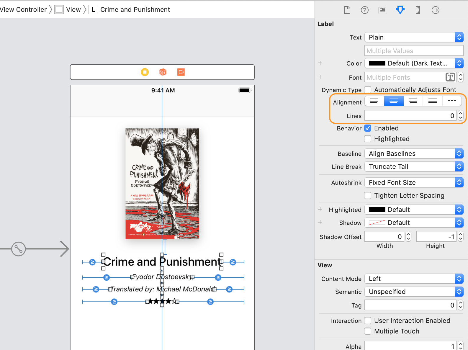
I also set the alignment of each label to Center, to keep text centered when it goes on a new line.
Using the Double-Length Pseudolanguage option in the Xcode preview again, we can see that our labels now work correctly.

Section 6:
Creating Auto Layout constraints programmatically in Swift
Writing Auto Layout code gives you access to functionality that is not available in Interface Builder. You can create far more advanced layouts adding constraint programmatically in Swift.
That comes at a cost though. You lose the visual feedback you get in Xcode, including the warnings about layout issues like conflicting constraints.
Auto Layout code also requires you to learn some extra concepts about how Auto Layout works.
Writing Auto Layout code when Interface Builder is not enough
In some cases, you have to deal with layout constraints in code.
Let me restate that you do this only when necessary.
I could not include in this article all the aspects of using Auto Layout in Interface Builder. While in this section I am going to show you a bit of code, that does not mean we explored Interface Builder entirely.
Despite the flexibility of Interface Builder, few cases require the use of Auto Layout code:
- Changing the properties of existing constraints at runtime. Programmatically, constraints are instances of
NSLayoutConstraint. Most of the properties of this class are read-only. Ironically though, you can change theconstantof any constraint. You access the constraint you create in Interface Builder using outlets, as you do for other views. The constant is not the only thing you can change. You can also activate and deactivate constraints, or change their priority. This allows you to create sophisticated dynamic layouts in Interface Builder, which you can then adjust with a few lines of code. - Animating layout changes. Animation in iOS requires code. Under Auto Layout though you can’t just move views. Recall that Auto Layout has the final say on the frames of views. Changing them to animate your content often does not work, since a layout pass resets any change you make. To animate UIs that use Auto Layout you have to change the constraints instead. Again, this might only require altering the existing constraints using outlets. More complex animations though need adding or removing constraints to reposition content.
- Altering the view hierarchy of highly dynamic interfaces. When the view hierarchy is affected by content, you cannot create it in Interface Builder. This means that you can set layout constraints only at runtime. In this case, you don’t have a choice. You have to add and remove constraints using code.
When you introduce Auto Layout code, things get more complicated.
You need to understand other Auto Layout concepts, like the layout pass and the related methods you need to override.
So, stick to Interface Builder as much as possible.
Setting up the view hierarchy of a view controller in code
Even when you set layout constraints programmatically, you still need to understand all the aspects of Auto Layout I covered in this article.
So, my advice is to learn how Auto Layout works visually, using Interface Builder, before writing any code.
Here I will show you a short example of Auto Layout code.
Let’s suppose that we need, for some reason, to lay out UI of our view controller in code.
That still requires the same two steps we go through when using Interface Builder:
- First, we create the view hierarchy.
- Then, we set the layout constraints.
In this case, all our views are inside the view controller. Rebuilding that view hierarchy is easy, although tedious.
class ViewController: UIViewController {
	override func viewDidLoad() {
		super.viewDidLoad()

		let coverImageView = ShadowedImageView(frame: .zero)
		coverImageView.image =  imageLiteral(resourceName: "Crime and punishment")
		coverImageView.contentMode = .scaleAspectFit
		view.addSubview(coverImageView)

		let titleLabel = UILabel()
		titleLabel.text = "Crime and Punishment"
		titleLabel.font = UIFont.systemFont(ofSize: 24.0, weight: .medium)
		titleLabel.numberOfLines = 0
		titleLabel.textAlignment = .center
		view.addSubview(titleLabel)

		let authorLabel = UILabel()
		authorLabel.text = "Fyodor Dostoevsky"
		authorLabel.font = UIFont.italicSystemFont(ofSize: 14.0)
		authorLabel.numberOfLines = 0
		authorLabel.textAlignment = .center
		view.addSubview(authorLabel)

		let translatorLabel = UILabel()
		translatorLabel.text = "Translated by: Michael McDonald"
		translatorLabel.font = UIFont.italicSystemFont(ofSize: 14.0)
		translatorLabel.numberOfLines = 0
		translatorLabel.textAlignment = .center
		view.addSubview(translatorLabel)

		let ratingLabel = UILabel()
		ratingLabel.text = "★★★★☆"
		ratingLabel.font = UIFont.systemFont(ofSize: 14.0)
		ratingLabel.numberOfLines = 0
		ratingLabel.textAlignment = .center
		view.addSubview(ratingLabel)
	}
}
While this code is quite long, it does not do anything special.
- It creates the instances of our image view and four labels.
- It sets their content (the image for the image view and the text of the labels).
- It sets the same properties we set in Interface Builder (the content mode for the image view, and fonts, number of lines and text alignment for the labels).
- It adds each view as a subview of the view controller’s view.
Here, I put all the code in the viewDidLoad() method. Normally, I would use a combination of property initializers, swift extensions to remove duplicated code, and the loadView() method.
That requires understanding the lifecycle of view controllers, so here I kept things simple.
It would be even better to create a custom view class for the view controller. That’s where I would build the view hierarchy. Then, I would use the MVVM pattern to configure it.
Adding Auto Layout constraints to an existing view hierarchy programmatically
The second step is adding layout constraints.
Again, we need to recreate all the constraints we had in Interface Builder. Auto Layout in code works the same as it works in Interface Builder, besides the obvious fact that you won’t see the result until you run your app.
There are many ways to create constraints in code:
- Using the member-wise initializer of the
NSLayoutConstraintclass. - Using the Auto Layout visual format language
- Using the
NSLayoutAnchorAPI
The last method is the recommended one. It uses a more fluent API which also provides extra type checking.
The first two methods are a bit obsolete. While they still work perfectly, when using them you need to understand to which view each constraint should be added.
That’s not always straightforward. Thankfully, the NSLayoutAnchor takes that problem away. So that’s what I am going to use here.
Using the NSLayoutAnchor API is quite simple. It has a declarative style that follows how you usually think about constraints.
class ViewController: UIViewController {

	override func viewDidLoad() {
		super.viewDidLoad()
		#warning("Use either this code or the views in the storyboard, or you will have a duplicated view hierarchy")

		let coverImageView = ShadowedImageView(frame: .zero)
		coverImageView.image =  imageLiteral(resourceName: "Crime and punishment")
		coverImageView.contentMode = .scaleAspectFit
		view.addSubview(coverImageView)

		let titleLabel = UILabel()
		titleLabel.text = "Crime and Punishment"
		titleLabel.font = UIFont.systemFont(ofSize: 24.0, weight: .medium)
		titleLabel.numberOfLines = 0
		titleLabel.textAlignment = .center
		view.addSubview(titleLabel)

		let authorLabel = UILabel()
		authorLabel.text = "Fyodor Dostoevsky"
		authorLabel.font = UIFont.italicSystemFont(ofSize: 14.0)
		authorLabel.numberOfLines = 0
		authorLabel.textAlignment = .center
		view.addSubview(authorLabel)

		let translatorLabel = UILabel()
		translatorLabel.text = "Translated by: Michael McDonald"
		translatorLabel.font = UIFont.italicSystemFont(ofSize: 14.0)
		translatorLabel.numberOfLines = 0
		translatorLabel.textAlignment = .center
		view.addSubview(translatorLabel)

		let ratingLabel = UILabel()
		ratingLabel.text = "★★★★☆"
		ratingLabel.font = UIFont.systemFont(ofSize: 14.0)
		ratingLabel.numberOfLines = 0
		ratingLabel.textAlignment = .center
		view.addSubview(ratingLabel)

		view.layoutMargins = UIEdgeInsets(top: 24.0, left: 24.0, bottom: 24.0, right: 24.0)
		let margins = view.layoutMarginsGuide

		coverImageView.translatesAutoresizingMaskIntoConstraints = false
		coverImageView.centerXAnchor.constraint(equalTo: view.centerXAnchor).isActive = true
		coverImageView.topAnchor.constraint(equalTo: margins.topAnchor).isActive = true
		coverImageView.heightAnchor.constraint(equalToConstant: 225.0).isActive = true
		coverImageView.widthAnchor.constraint(equalToConstant: 150.0).isActive = true

		titleLabel.translatesAutoresizingMaskIntoConstraints = false
		titleLabel.centerXAnchor.constraint(equalTo: view.centerXAnchor).isActive = true
		titleLabel.topAnchor.constraint(equalTo: coverImageView.bottomAnchor, constant: 32.0).isActive = true
		titleLabel.leadingAnchor.constraint(greaterThanOrEqualTo: margins.leadingAnchor).isActive = true
		titleLabel.trailingAnchor.constraint(greaterThanOrEqualTo: margins.trailingAnchor).isActive = true

		authorLabel.translatesAutoresizingMaskIntoConstraints = false
		authorLabel.centerXAnchor.constraint(equalTo: titleLabel.centerXAnchor).isActive = true
		authorLabel.topAnchor.constraint(equalTo: titleLabel.bottomAnchor, constant: 8.0).isActive = true
		authorLabel.leadingAnchor.constraint(greaterThanOrEqualTo: margins.leadingAnchor).isActive = true
		authorLabel.trailingAnchor.constraint(greaterThanOrEqualTo: margins.trailingAnchor).isActive = true

		translatorLabel.translatesAutoresizingMaskIntoConstraints = false
		translatorLabel.centerXAnchor.constraint(equalTo: authorLabel.centerXAnchor).isActive = true
		translatorLabel.topAnchor.constraint(equalTo: authorLabel.bottomAnchor, constant: 8.0).isActive = true
		translatorLabel.leadingAnchor.constraint(greaterThanOrEqualTo: margins.leadingAnchor).isActive = true
		translatorLabel.trailingAnchor.constraint(greaterThanOrEqualTo: margins.trailingAnchor).isActive = true

		ratingLabel.translatesAutoresizingMaskIntoConstraints = false
		ratingLabel.centerXAnchor.constraint(equalTo: translatorLabel.centerXAnchor).isActive = true
		ratingLabel.topAnchor.constraint(equalTo: translatorLabel.bottomAnchor, constant: 8.0).isActive = true
		ratingLabel.leadingAnchor.constraint(greaterThanOrEqualTo: margins.leadingAnchor).isActive = true
		ratingLabel.trailingAnchor.constraint(greaterThanOrEqualTo: margins.trailingAnchor).isActive = true
	}
}
These lines should read quite naturally. You start each line with one anchor and then attach it to another one with one of the many methods offered by the NSLayoutAnchor interface.
Still, there are a couple of important details to keep in mind.
- It’s important to set the
translatesAutoresizingMaskIntoConstraintsproperty of each view tofalse. This is needed for legacy reasons. If you forget this, Auto Layout will add a bunch of extra constraints to your view hierarchy, which will probably break your layout. Luckily, if you forget, this mistake is easy to spot. In the resulting log message, these constraints have theNSAutoresizingMaskLayoutConstraintidentifier. - Notice that every line of code ends with
.isActive = true. That’s the piece of the code that adds a constraint to the view hierarchy. If you forget that, your constraints won’t have any effect. This is the second mistake to check when the resulting layout is not what you expected.
You can delete all the UI in the storyboard and run the app in the simulator. The result is the same we had before.
Bonus section:
Going past simple constraints for highly-adaptive, universal user interfaces
The Auto Layout concepts I covered in this article are all fundamental.
Still, the landscape is vast. There are more concepts you must know to become proficient in Auto Layout.
Here are the most fundamental aspects of Auto Layout you need to understand after you learn how basic constraints work.
- Using stack views for grid-like content. Stack views are special views that arrange their content. They still use layout constraint internally, but you don’t need to care. Instead, you can focus on the higher-level aspects like axis, distribution, spacing, etc. You can also nest stack views, which makes them very powerful. They also have extra nice features, like removing hidden views, which is something you can only do in code otherwise. Apple’s guide section on stack views is titled Auto Layout Without Constraints, but that’s misleading. You still need to understand all the concepts from this article. You use simple constraints to position stack views in the safe area like you would for any other view. The intrinsic content size of a stack view’s subviews also plays an essential role in the layout.
- Dynamic scrolling interfaces. Most, if not all, the screens in your apps will be long enough to need scrolling. While it is possible to make Auto Layout work with scroll views, that adds needless complexity. My advice is to avoid scroll views when possible. Use table views or collection views instead. Again, this does not exempt you from understanding Auto Layout’s basics, since you need them to lay out the content of table views’ and collection view’s cells.
- Working across devices and orientations using size classes. When you write apps that work on both directions or create universal apps that work on both the iPhone and the iPad, having your UI expand with the screen is not enough. On a big screen, you have to reposition your views to make better use of the extra space. For that, you use size classes. These let you alter your layouts based on the screen’s aspect ratio.
All these features are available in Interface Builder. So, again, you need to use code only for advanced and complex cases.
Architecting SwiftUI apps with MVC and MVVM
It's easy to make an app by throwing some code together. But without best practices and robust architecture, you soon end up with unmanageable spaghetti code. In this guide I'll show you how to properly structure SwiftUI apps.
Matteo has been developing apps for iOS since 2008. He has been teaching iOS development best practices to hundreds of students since 2015 and he is the developer of Vulcan, a macOS app to generate SwiftUI code. Before that he was a freelance iOS developer for small and big clients, including TomTom, Squla, Siilo, and Layar. Matteo got a master’s degree in computer science and computational logic at the University of Turin. In his spare time he dances and teaches tango.
Would you decide to publish this guide in EPUB?
Unfortunately I am swamped and I have barely the time to write these articles. I have other priorities, so I won’t be able to do that.
This is amazing. Thanks for the write up.
Nice article. A small correction though: In section 3 the correct formula would be `Orange.Leading = 1.0 x Purple.Trailing + 8.0`
Ah, you are right. The constant actually follows the orientation of the coordinate system. I’ll fix that.
Hi Matteo!
I believe your article is very good and useful. I am going to translate it in russian. May I publish the translation? Of Course I going to put there link of your source.
Sure, go on.
Ok, thanks!